Client: YCN New Now / University Brief
NAME
As part of the YCN New Now competition, travel agents STA Travel asked young designers to come up with a way to bring to life their brand and ethos of '[Starting] The Adventure' through a campaign or idea, and show how we could use this to engage with students and Generation Z.
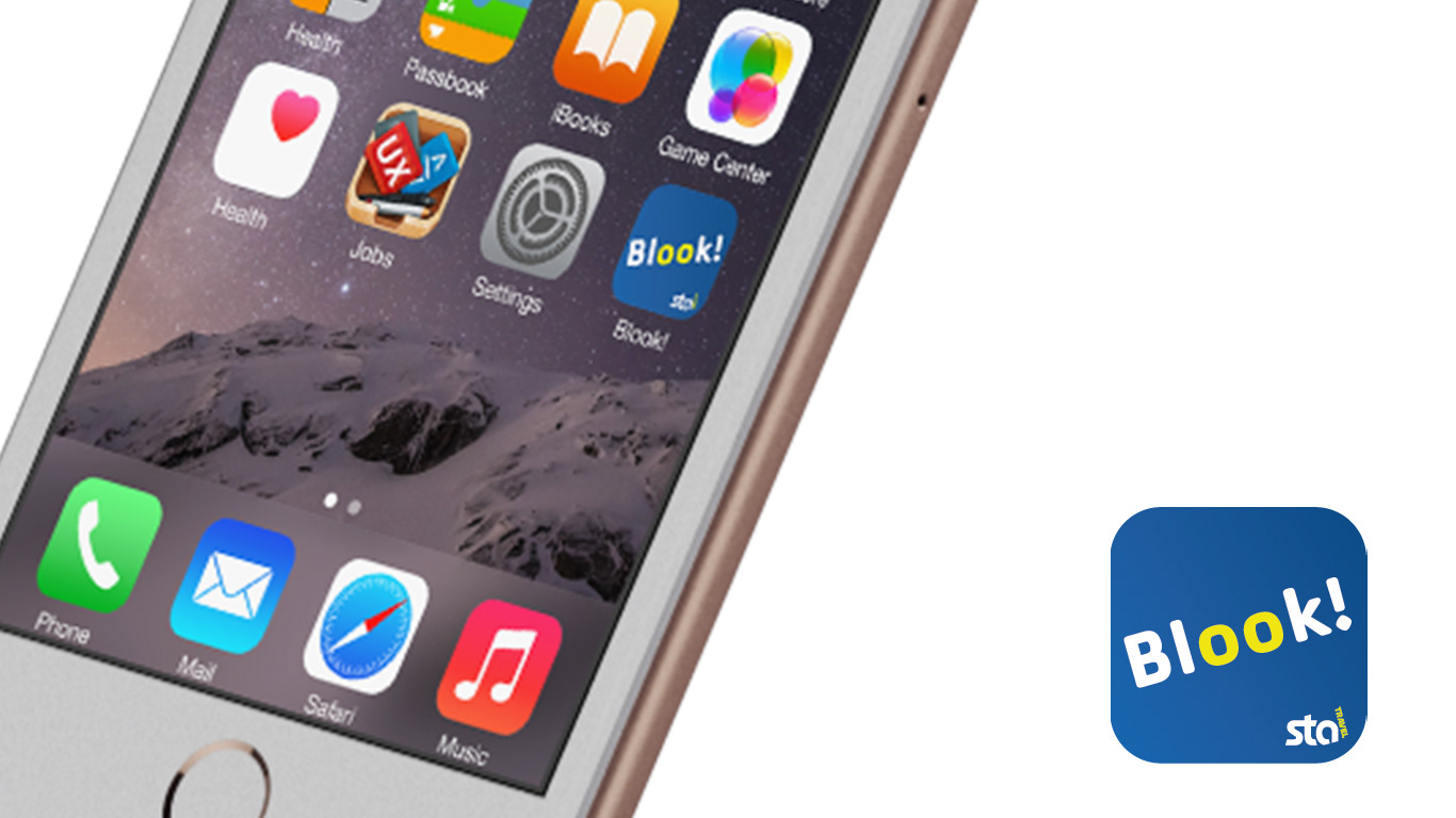
The app needed a separate name and identity to differentiate it from the other app STA Travel currently have on the App Store. After considering various different names, I settled on Blook! as it combines the two essential elements of the app - looking for holidays and booking them. I added the exclamation mark to help convey a sense of excitement and innovation. The app icon was developed in the brand colours of STA Travel to show the app and company are linked, and would appear on the App Store as ‘Blook! by STA Travel’. The double ‘oo’ has been highlighted in a different colour to make it seem like eyes, whilst also highlighting there is more than one choice of destination. I placed the type at the same angle as the STA logo to ensure more brand consistency. This also helped the icon look less flat and exciting.
APP
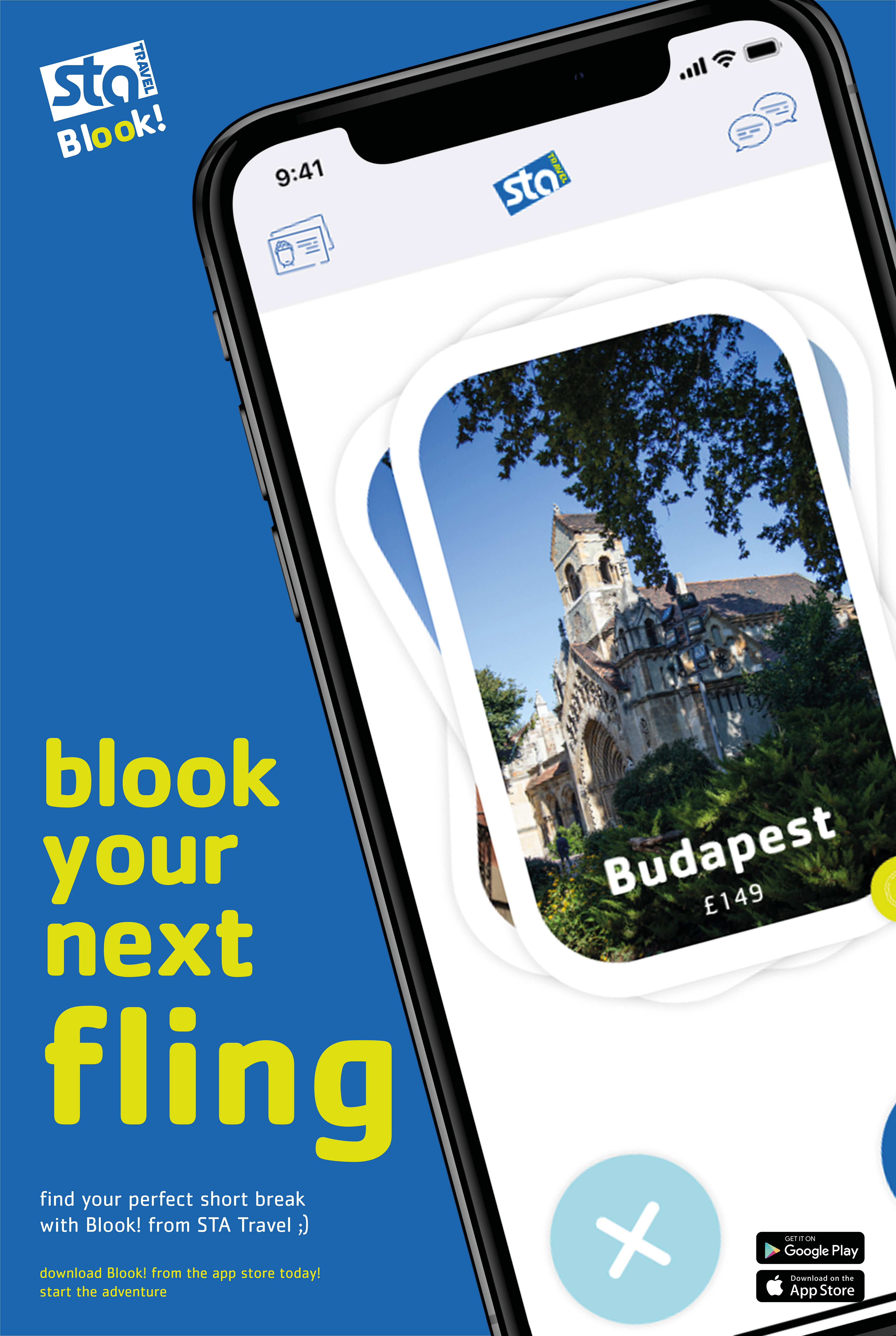
I decided to develop the idea of producing a dating-like app for choosing a holiday as I thought it was a unique and innovative way of choosing a holiday and due to the popularity of dating apps amongst young people, it would appeal to them and is a more fun way of doing choosing a destination, rather than trawling through booking websites such as booking.com and trivago. Furthermore, it will ensure that business is booked through STA Travel, rather than other sites and travel agents. To develop the app, I decided to prototype it in Adobe XD so I create a working prototype so it would be easier to understand if the app would be released properly.
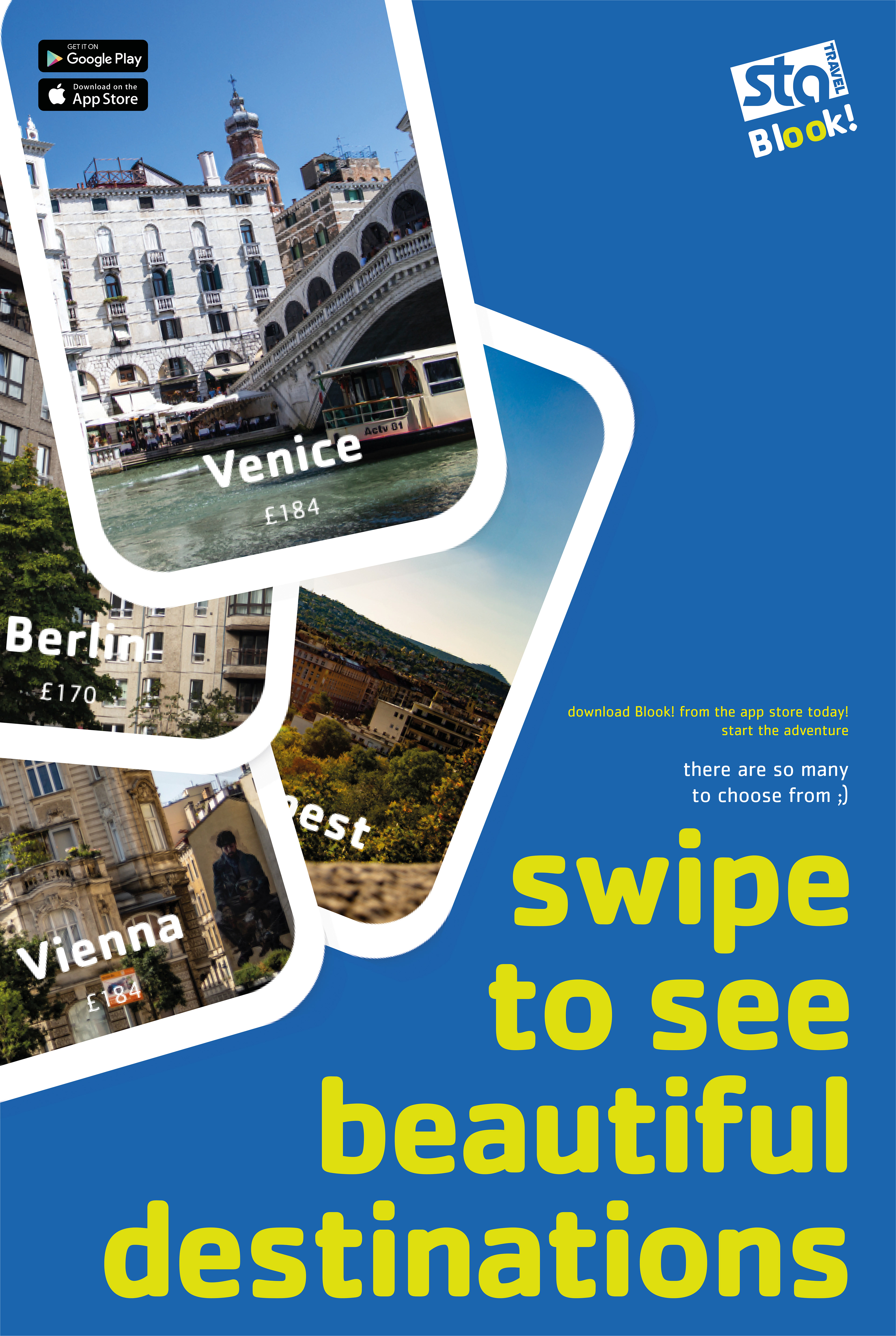
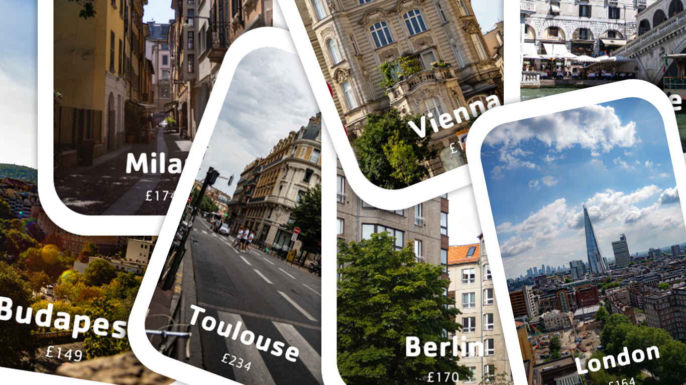
I adopted the card layout to display the holidays and locations on the main screen, but modelled them into the shape of plane windows to represent the idea of looking out of the window and deciding where you want to land. The ‘I want to travel here’ symbol is a plane to resemble the idea of jetting off to that location, rather than a tick or heart which is often used in dating apps. This icon is in the richer, darker STA blue to make it a more prominent choice, in contrast to the light blue for the no button. All the icons used throughout the app are part of the set provided by STA Travel to ensure brand identity and consistency. I have used the STA Travel font throughout the app. This is an unusual move, as generally in iOS apps the standard Apple font, San Fransisco, is used. However, I wanted to ensure the tie between STA and the app is strong, hence the placement of the logo in the main screens of the app too. The slogan of the company feature on both the load screen at the beginning and the ‘match’ screen as essentially, the adventure does in fact start at both those points - the idea of the adventure of choosing a holiday first and then going on to booking it. Originally, the statements on the profile screen were simple statements. However, to align it more to STA Travel’s identity, more conversational and fun statements were used.
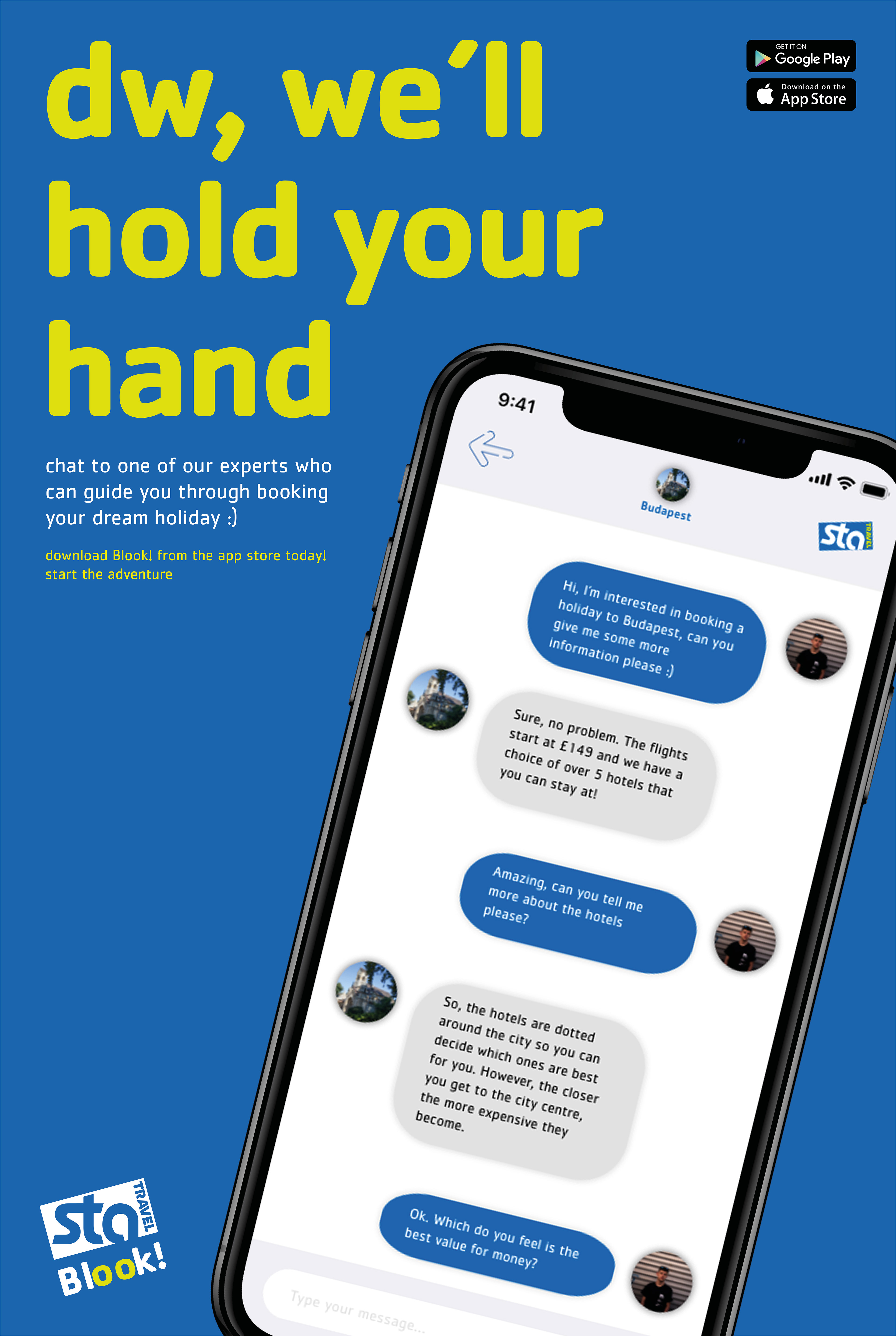
POSTERS
I started developing the posters using the idea of ‘[starting] the adventure’ in the contexts of starting a new relationship, STA Travel and holidays in general. However, I felt the copy could push boundaries a bit more, and therefore developed new lines of copy. The posters are aimed at promoting the key features of the app, whilst the headline copy is slightly ambiguous to gain attention, yet the second line makes the headline a lot clearer. The body text is the same on each poster to ensure consistency. The logo STA Travel and the app feature on all the poster to make it clear the two are linked. The posters feature a phone to make it clear that is an app, rather than trying to promote going into a store to book the holiday. They are rotated at the same angle as the STA Travel logo to ensure brand consistency.