Client: #olympiclogochallenge
Date: April 2020

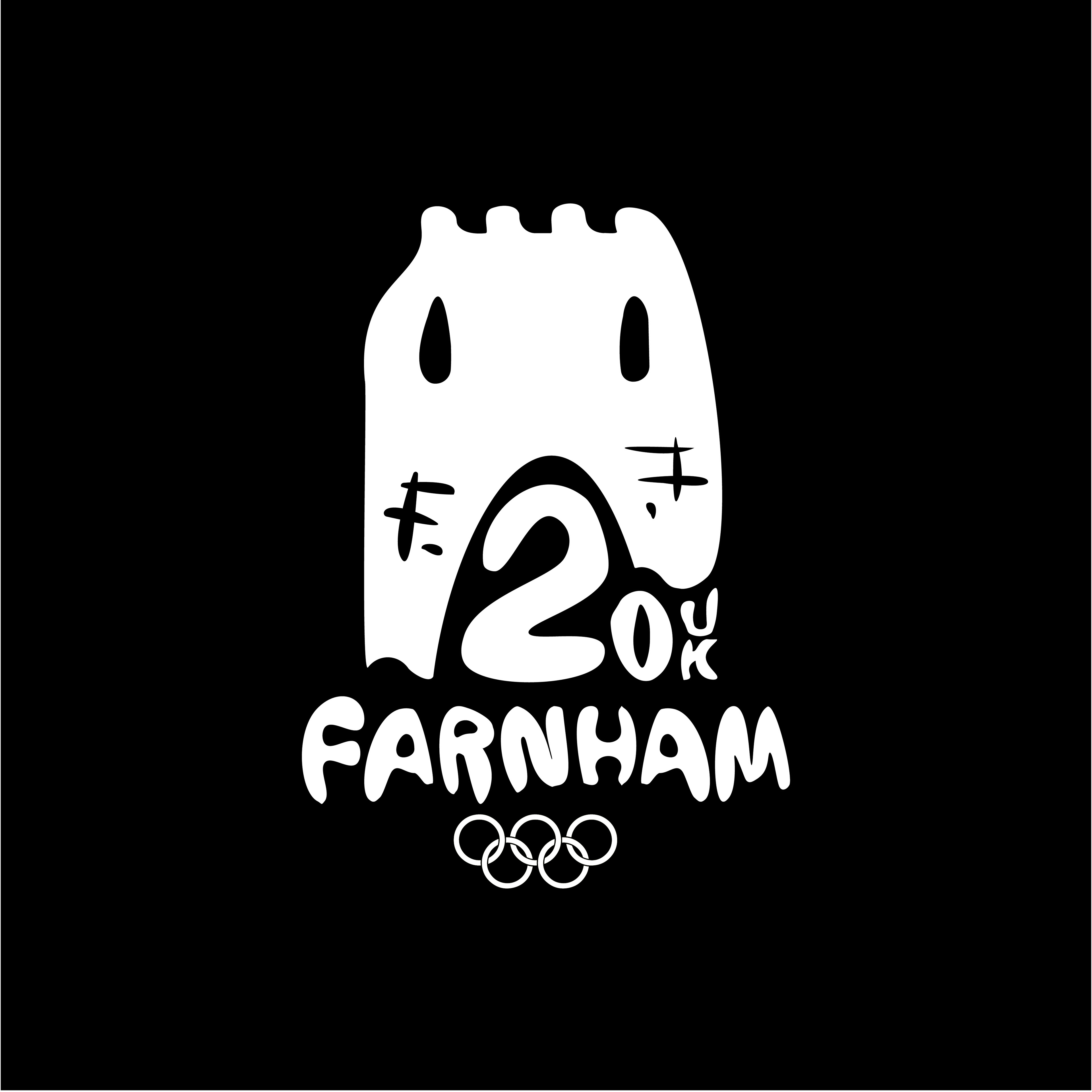
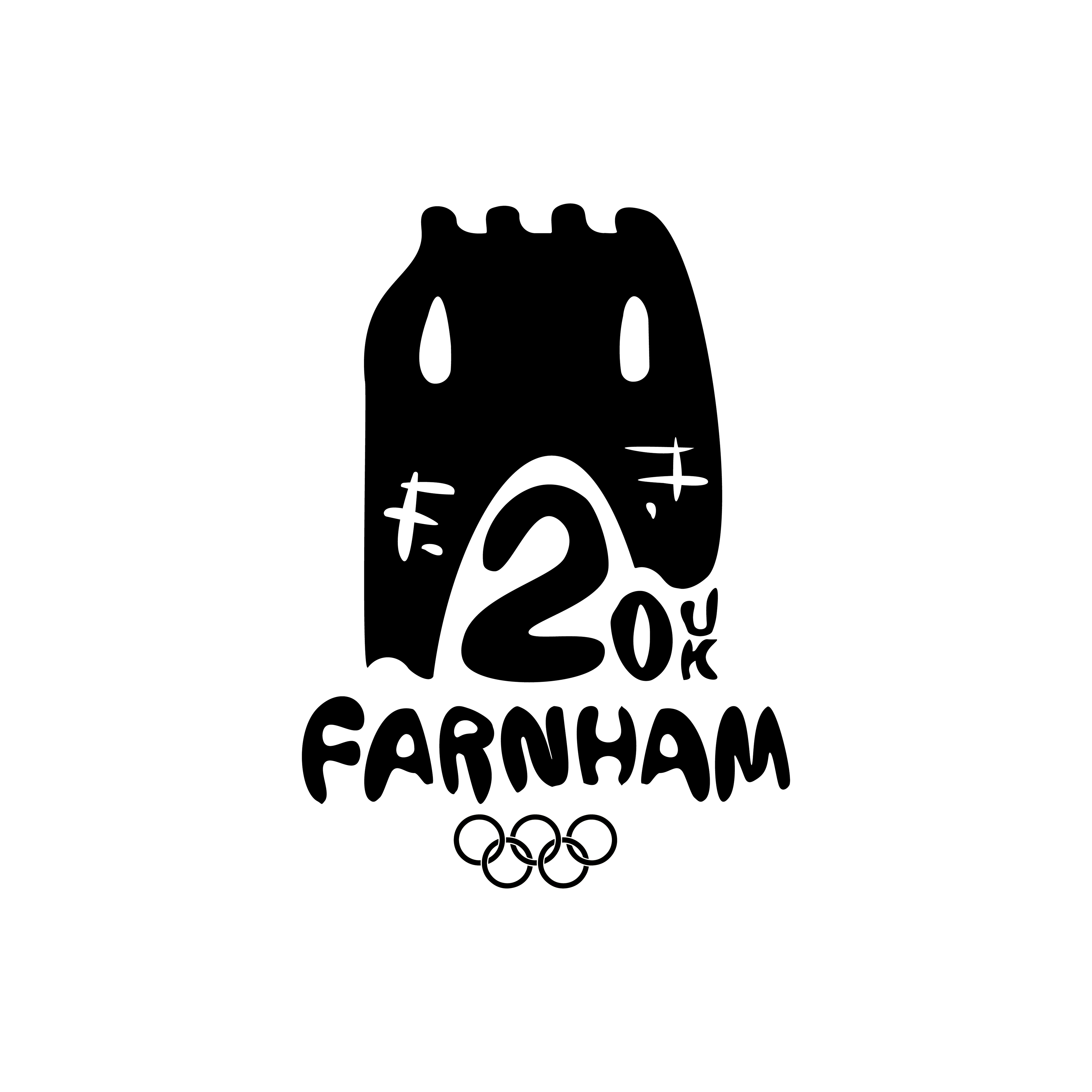
LOGO
The main shape of the logo is based around the castle that Farnham is most known for, whilst also drawing inspiration from the Georgian architecture that populated the town. The ‘F’ looking marks, alongside the colouring of the logo, are inspired by the red brick buildings that are common in the town, whilst also representing the castle’s ruins. The four turrets / chimneys illustrate the number of times the United Kingdom will have hosted the Olympic Games (1908, 1948, 2012 in London and 2020 in Farnham). The castle windows are inspired by the shape of the windows of Waverley Abbey, the first Cistercian abbey in England, which is on the outskirts of the town. The archway takes a similar shape to that of the entrance to Mother Ludlam’s Cave, which plenty of the local folklore is inspired by. The 20 gives the year the event is held - 2020, whilst the UK tells the audience which country the games is being held in, as before very few would have known where Farnham is. The 2 is also designed to mirror a meandering river, which is homage to the River Wey that flows through the town. The whole logo is designed in a hand drawn manner, which represents Farnham’s status as a craft town. It’s especially known for its pottery, so the handcrafted typeface, and logo in general, are designed to look as if it’s been sculpted out of clay.