Client: University Brief
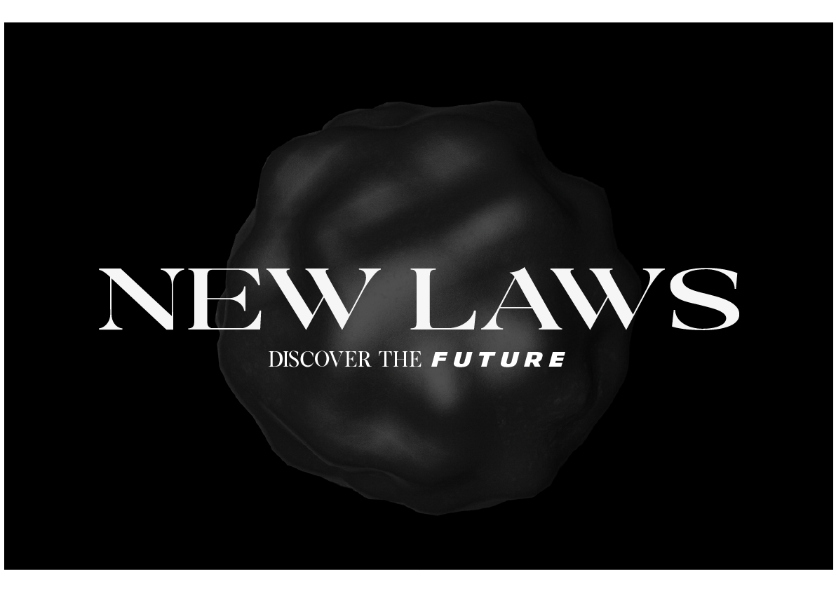
LOGO
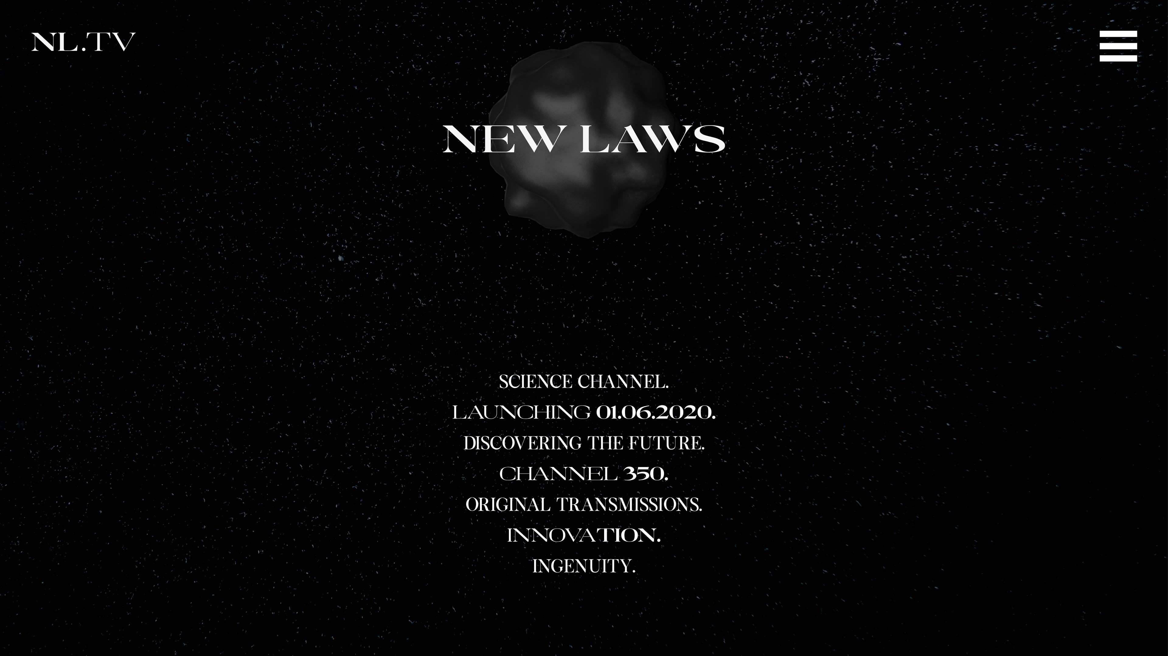
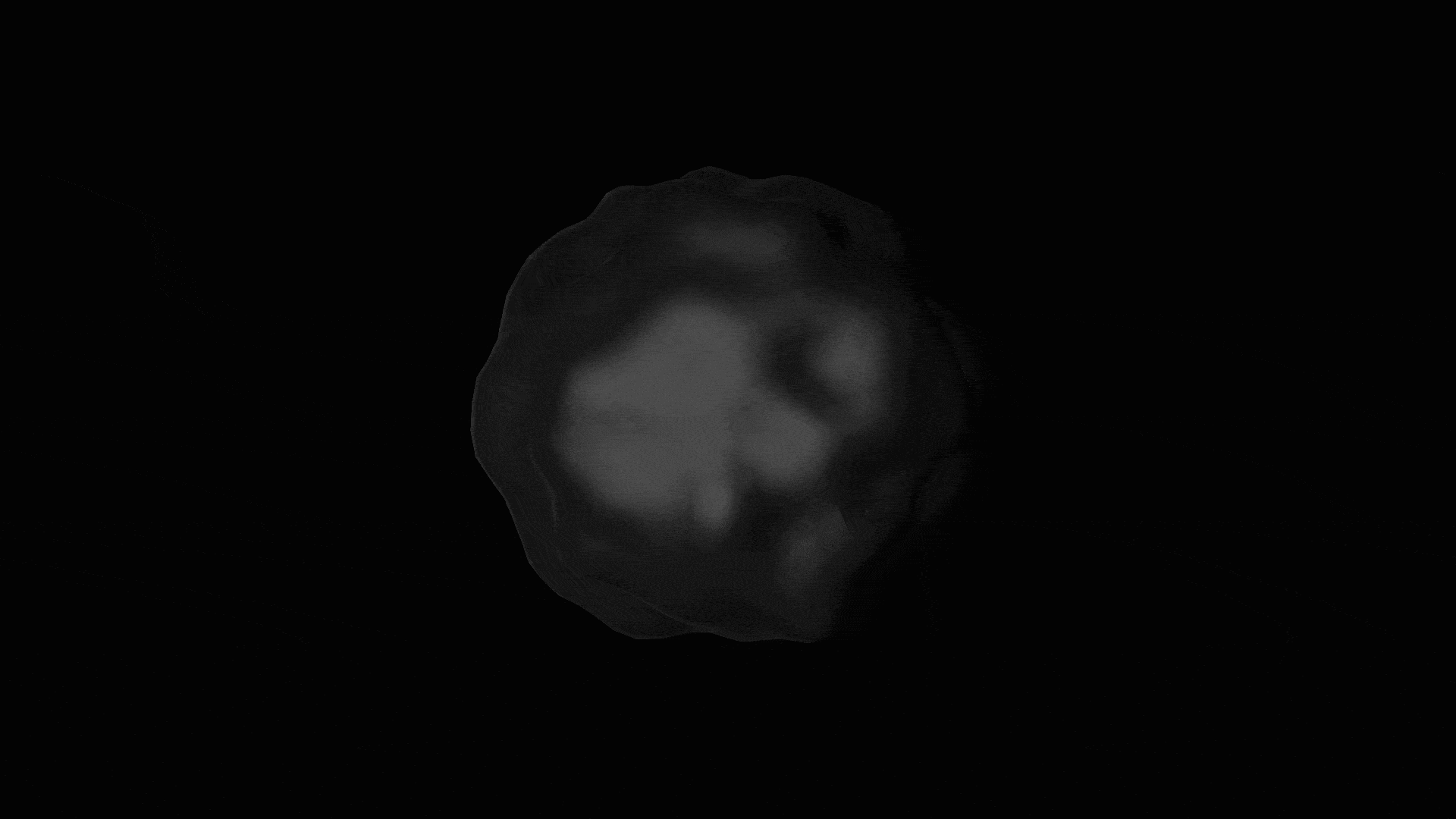
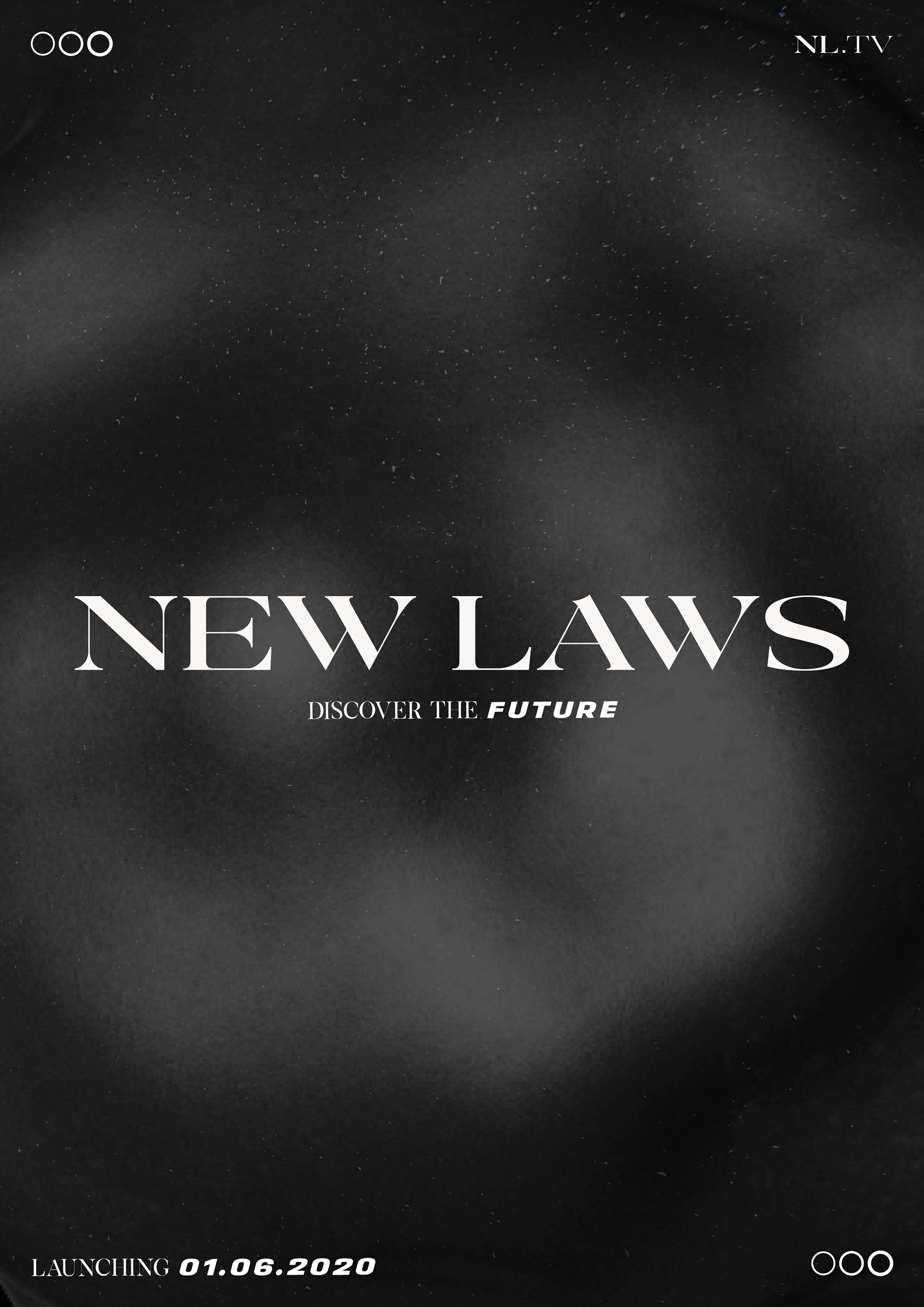
After experimenting on Cinema4D, I created the deformed grey sphere. I felt this represented various aspects of science: space, atoms, and cells. I decided on a neutral colour pallette because it creates a mysterious feel - as this reflects the idea of discovering the future as after all, we don’t know what it entails. The modern serif typeface was a choice I made to make the channel stand out from the rest, as it was stereotypical of channels to use a sans- serif font. For the main title, I decided to use the extended version of the font to create a clear differentiation from the name of the channel to any other writing that would appear alongside it. Although typically a graphic design no-no, I decided I would style ‘future’ to completely contrast the sans-serif font used for the rest of the logo. I chose this font and styling to be more futuristic; this inspired by my research into branding used in sci-fi. I also extended the tracking to change the way the viewer would read the word: dragging it out and making it softer, adding to the mystery of the future. This also reflects the channels emphasis on the future of scientific discovery, but also its philosophy of bringing the future of broadcasting to its viewers. I also used a pure white to colour future, compared to the off-white used in the rest of the type. During the development phase, I experimented with using three circles as part of the logo. This was meant to symbolise objects in science: medicine, space, biology and atoms as they are all circular in shape. It also has similarities to a loading symbol, with the idea being New Laws is loading the future, and the channel itself, which relates to technological advancements. However, I felt this made the logo imbalanced so decided to remove it from the primary logo, and it would feature across the channel’s promotional material.

STING
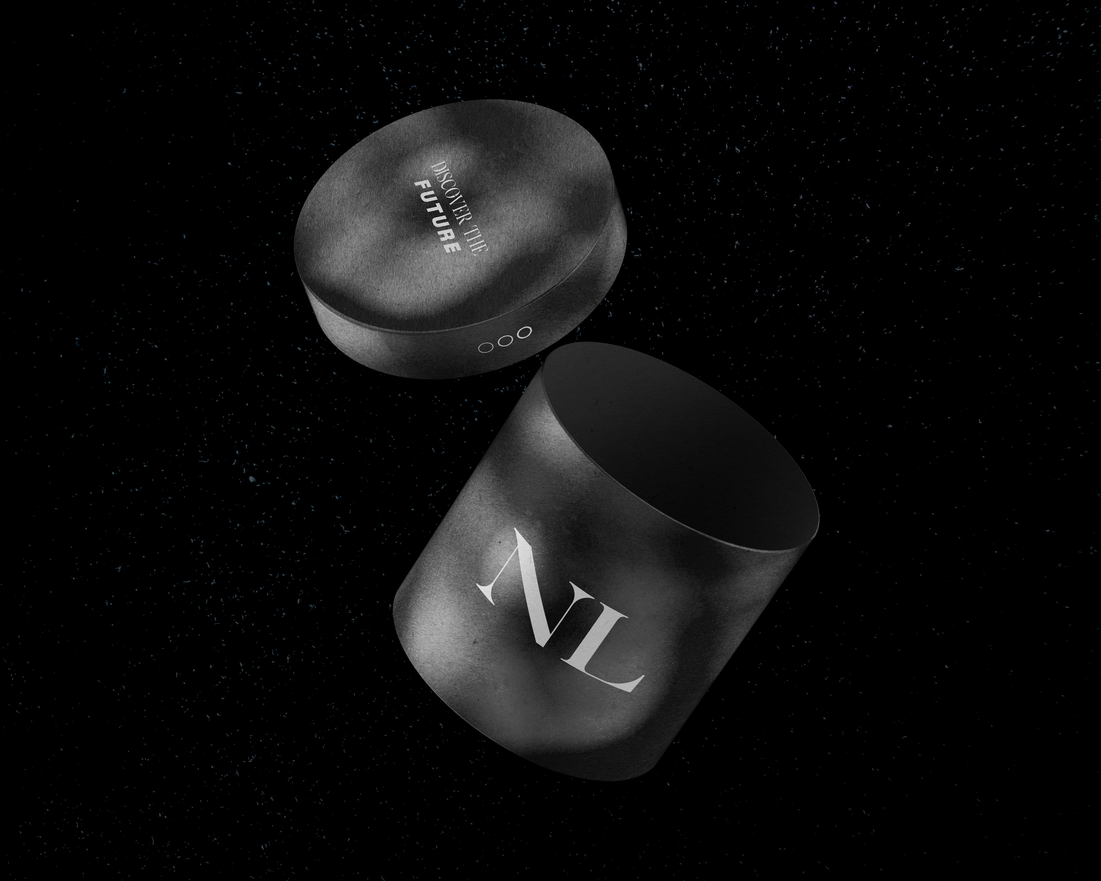
With strict instructions that the sting had to last exactly 10 seconds, this was quite a challenge. Ultimately, it needed to capture the channel's brand in this short amount of time. I wanted to use the sphere to create interesting textures and angles for the text to sit on, and eventually ended up with the graphic below. The soundtrack for the stings that would be the sound of the channel, and therefore I wanted to create something that adds to the elements of the mystery whilst also being contemporary, hence the mix of the sounds at the beginning that then transforms into a contemporary reverse hi-hat beat when ‘discover the future’ appears on the screen, as this is meant to reflect that aspect.
DIRECT MAIL
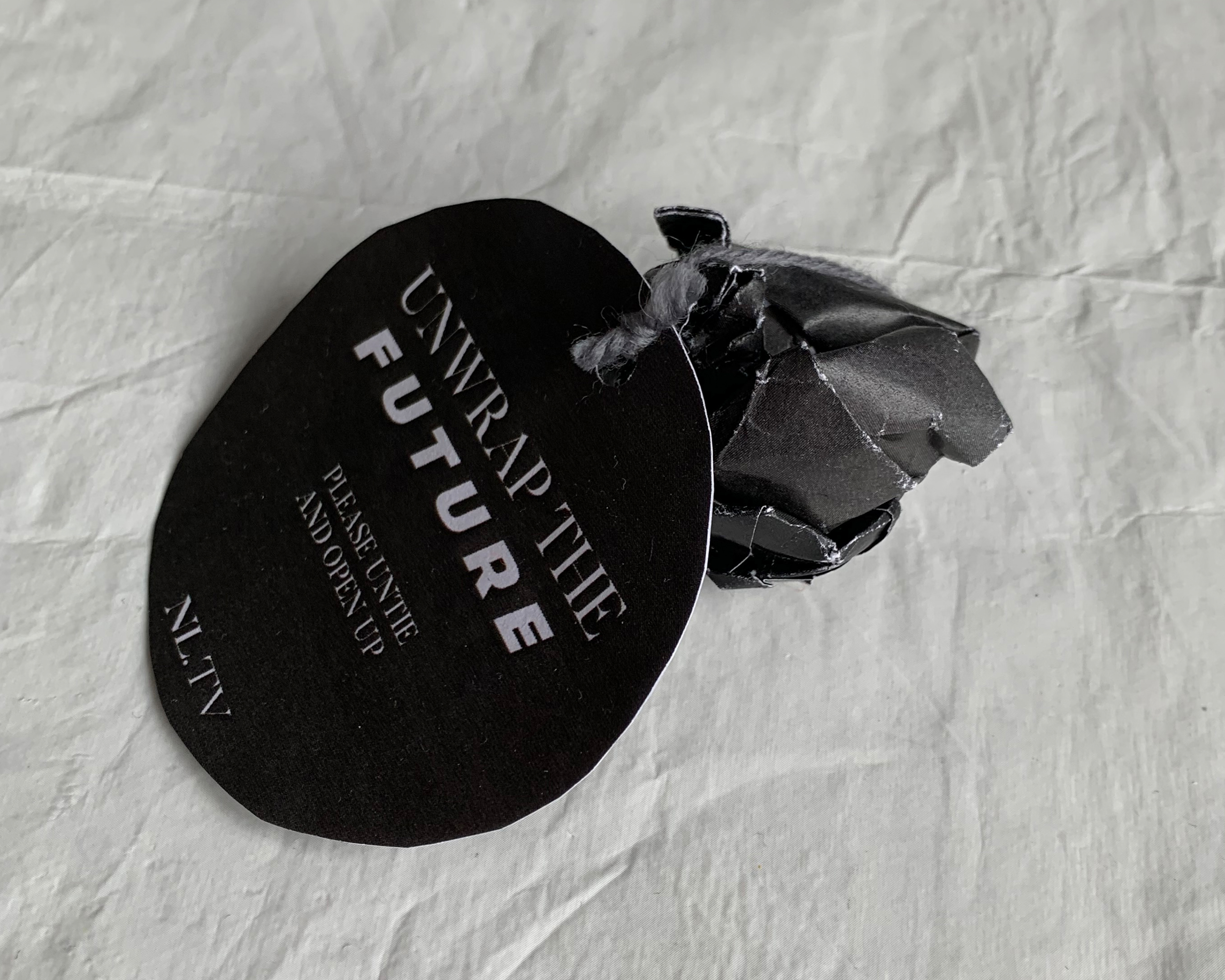
As part of the campaign to promote the channel's launch, a piece of direct mail had to be created. Many people just throw away the marketing that comes through their letterbox, so therefore it had to be innovative and unusual to attract attention. Originally, I had developed a flyer that you scanned with your phone that would produce an animation on screen about the channel's launch. However, I decided that persuading people to download an app capable of this was too long winded, so therefore I abandoned this idea and though I needed to produce something physical to get immediate attention.
I then developed an idea centering around the shape of the sphere that was the icon of the New Laws logo. I was thinking about how I could physically recreate a shape similar, and thought that a scrunched up piece of paper was similar. Furthermore, people would not expect a rolled up piece of paper to come through the letterbox, and therefore are likely to pick it up. However, to make it seem not like rubbish, it needed something that would carry instructions, so I developed a label that would be wrapped around the ball of high quality paper (glossy, to create an interesting shine and texture), attached with metal wire (representing the development of new materials (illustrated by string in the mock-up photos). I then decided it would be delivered in a box, which is inspired by the work of Martin Creed. The box would be made out of sustainable materials, which again links to the idea of the channel being at the forefront of science.
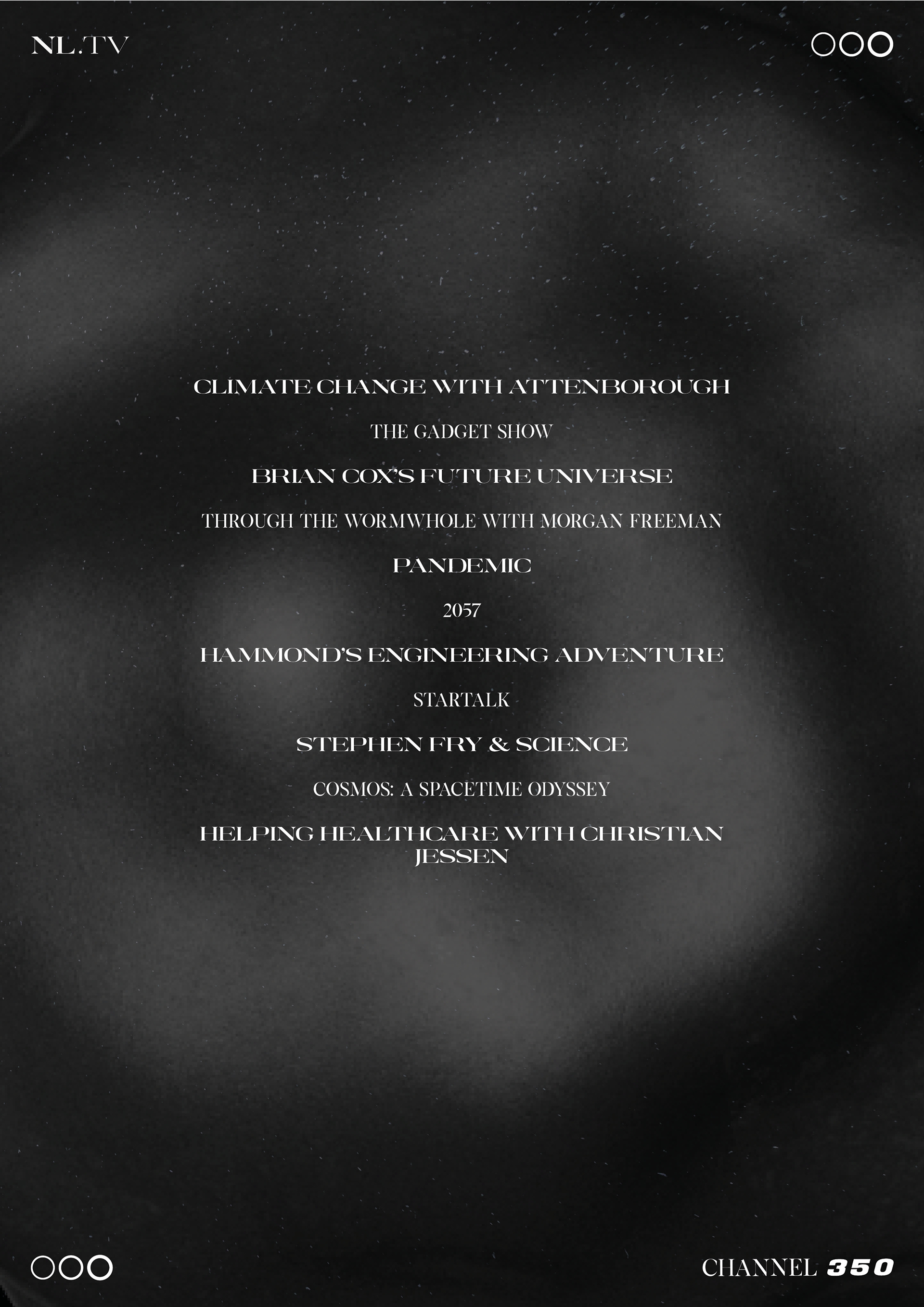
The leaflet itself went through various iterations, as I experimented with textures and layouts to create a unique look that would attract attention. I still wanted to carry on the brand’s sense of mystery so the information that was displayed on the leaflet was left to a bare minimum: the name of the channel, it’s launch date, microsite web address, channel number and a selection of the programmes that would air on the channel on the back. These are stylised in both the normal and extended version of the font to create some rhythm. Furthermore, the shows that are stylised in the extended font are originals, whilst the normal font has shows that have been aired on other channels. I have not made this explicitly clear on the leaflet as I want to give the reader something to work out to add to the mystery. Furthermore, when the paper is unwrapped, it has creased in it which makes it slightly illegible. This adds to the mystery of the channel, whilst also conceptually showing that we cannot predict the future by the text not being clear.
MICROSITE
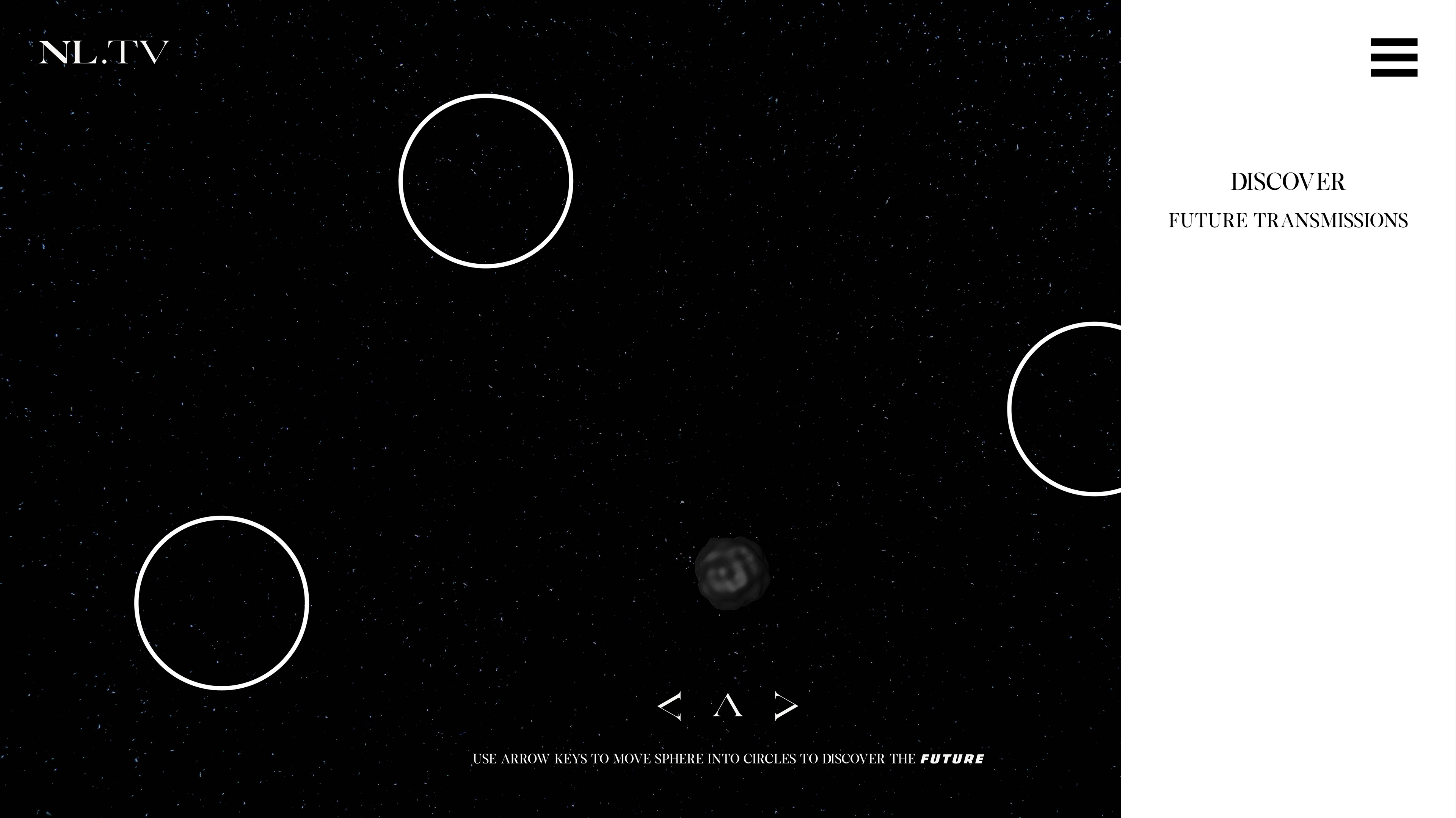
To help promote the site, a microsite was produced. I decided this would be game-based. I felt this was the best way to get multiple forms of interaction into the site, and therefore give people as much information as possible, but still keep the intrigue and mystery that is central to the brand. I started creating a wireframe for the homepage and then adding details, building it up until I had a rough mock-up of how I wanted each page to look. The names of the pages are deliberately chosen to create an element of mystery and the terminology used is related to the brand and science. To in-keep with the brand, the arrow keys are set in the same font as ‘New Laws’ rather than creating unique icons, as I felt this would make all the elements more coherent.
The game is using the arrow keys to move the sphere into the cirlces, in which some have videos of snippets of programmes that will air on the channel. These have been distorted to create
the impression that they are being beamed from space or not been transmitted properly, as if they were being sent from the future. Below is a mock-up animation of what this would look like. The text on the ‘Future Transmission’ page is the same as the text that lists the shows on the back of the leaflet, whilst the text on the ‘Discover’ page - which is essentially an about page - is deliberately jumbled to create the element of mystery and a challenge for the viewer to try and convince them to tune in to the channel when it launches. However, important information is highlighted by it being stylised in a thicker weight.
the impression that they are being beamed from space or not been transmitted properly, as if they were being sent from the future. Below is a mock-up animation of what this would look like. The text on the ‘Future Transmission’ page is the same as the text that lists the shows on the back of the leaflet, whilst the text on the ‘Discover’ page - which is essentially an about page - is deliberately jumbled to create the element of mystery and a challenge for the viewer to try and convince them to tune in to the channel when it launches. However, important information is highlighted by it being stylised in a thicker weight.