Client: A-Level Brief Revisited
NAME
The project initially started out under the brand name of Ava, a given name that was meant to make the airline feel like a person rather than a service. As the project expanded, using ROIS became more appropriate. ROIS is "king" when translated from its native French language, and this name is meant to represent how it treats its customers. As an airline has such an international reach, having the name in French helps it target the French-speaking markets as well as its home territory. Furthermore, the French have a well-known stereotype to be classy and luxurious, helping spread the message that the brand is trying to get across.

LOGO
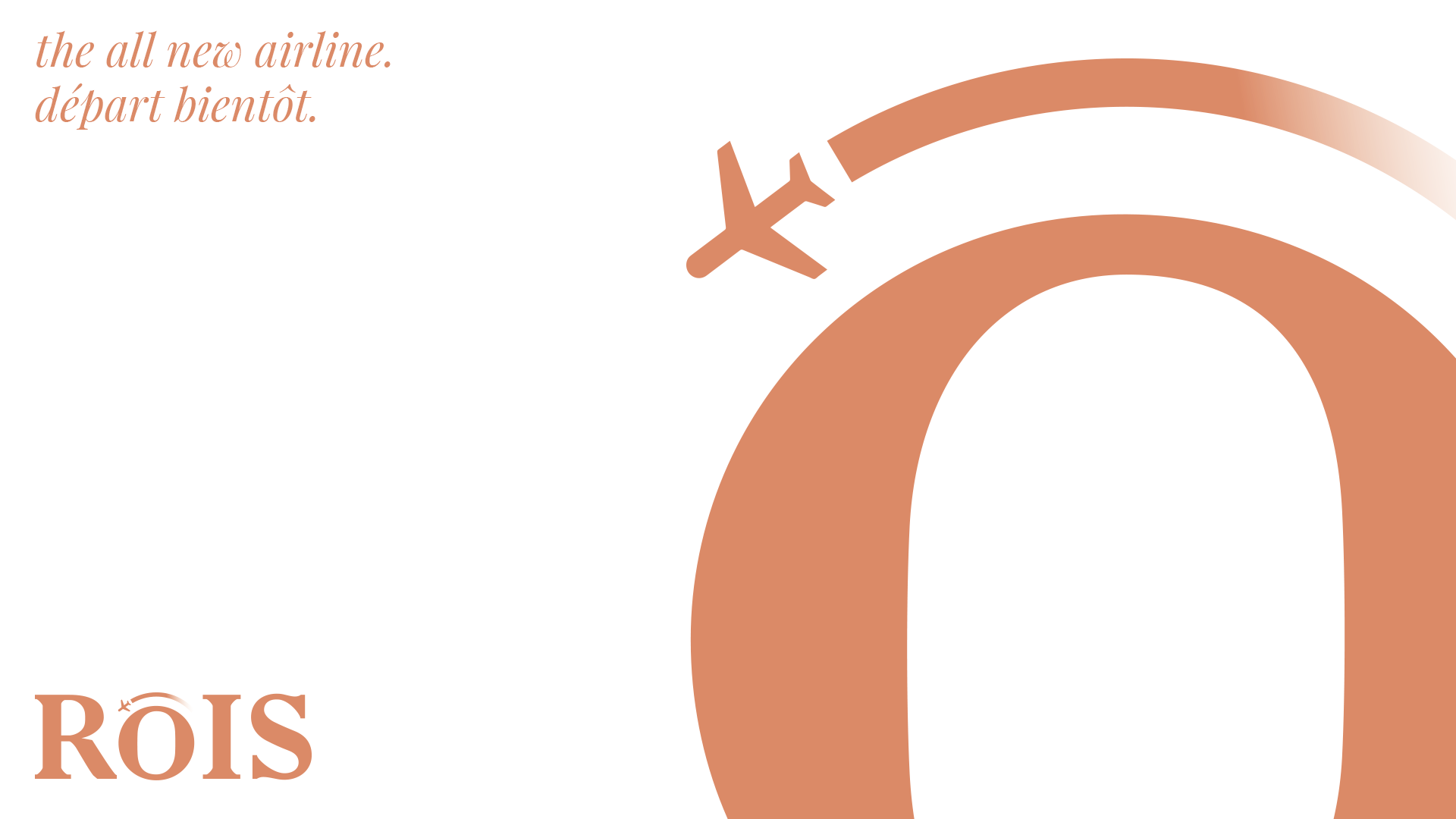
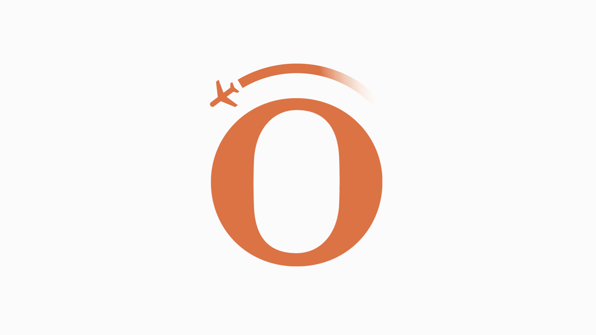
Serif typefaces are often associated with classiness, and therefore it only seemed right that the logo would be typeset in this. A slightly more slab-like typeface was selected so it still aired a level of modernity with it, as there is no use in an airline feeling old fashioned and out-dated as the connotations that would come with this would harm the brand. A heavy weight also seemed appropriate to help it stand out. The off-bronze colour was chosen as it is purely unique; whereas typical colours such as purple already saturate the airline market, whilst also linking to a precious metal - rather than the stereotypical gold or silver. The icon, to work at smaller sizes and be a mark the brand can be instantly recognised by, is just the iconic O extracted from the full word mark. Although slightly cliche, the mark makes it instantly obvious as to what industry ROIS is part of, otherwise it would have not been explicitly clear. The plan is flying anti-clockwise around the O / Earth to suggest the airline is a trendsetter and moves differently to the rest.
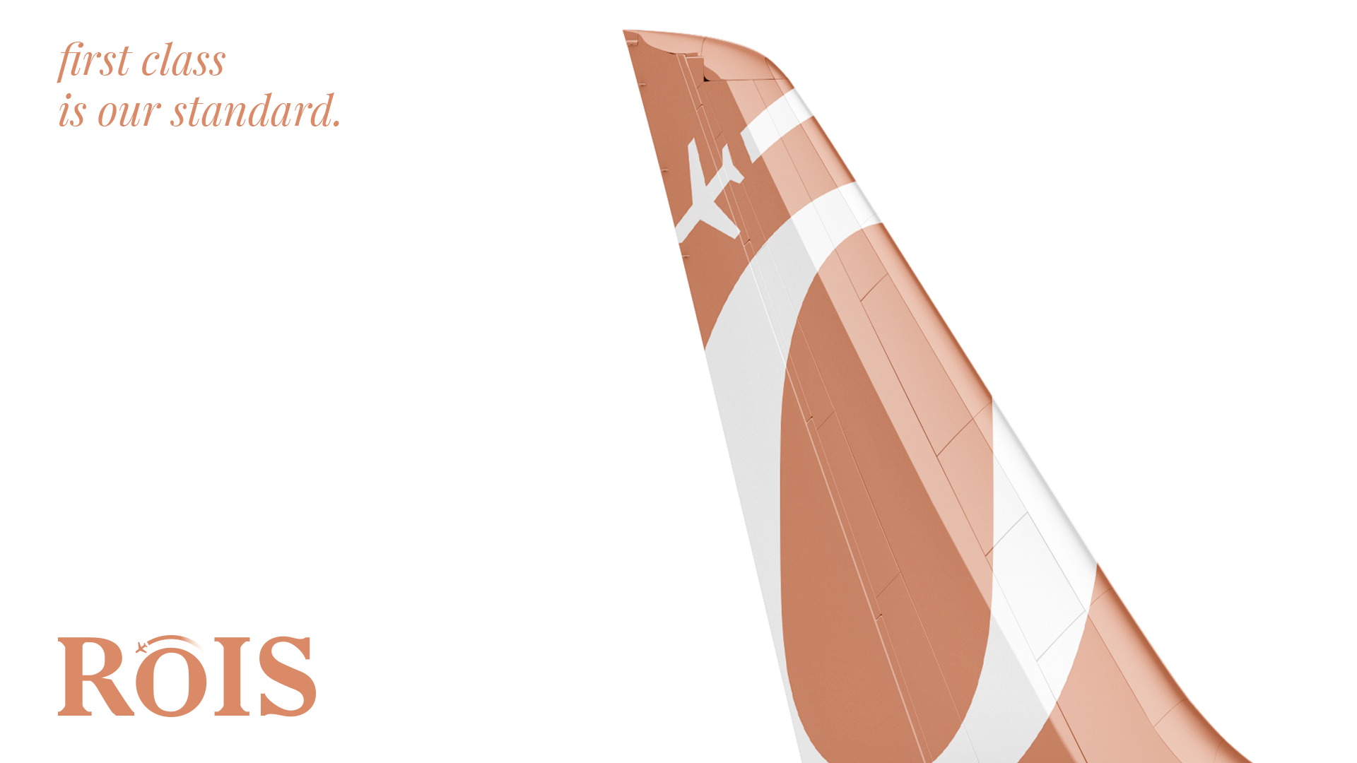
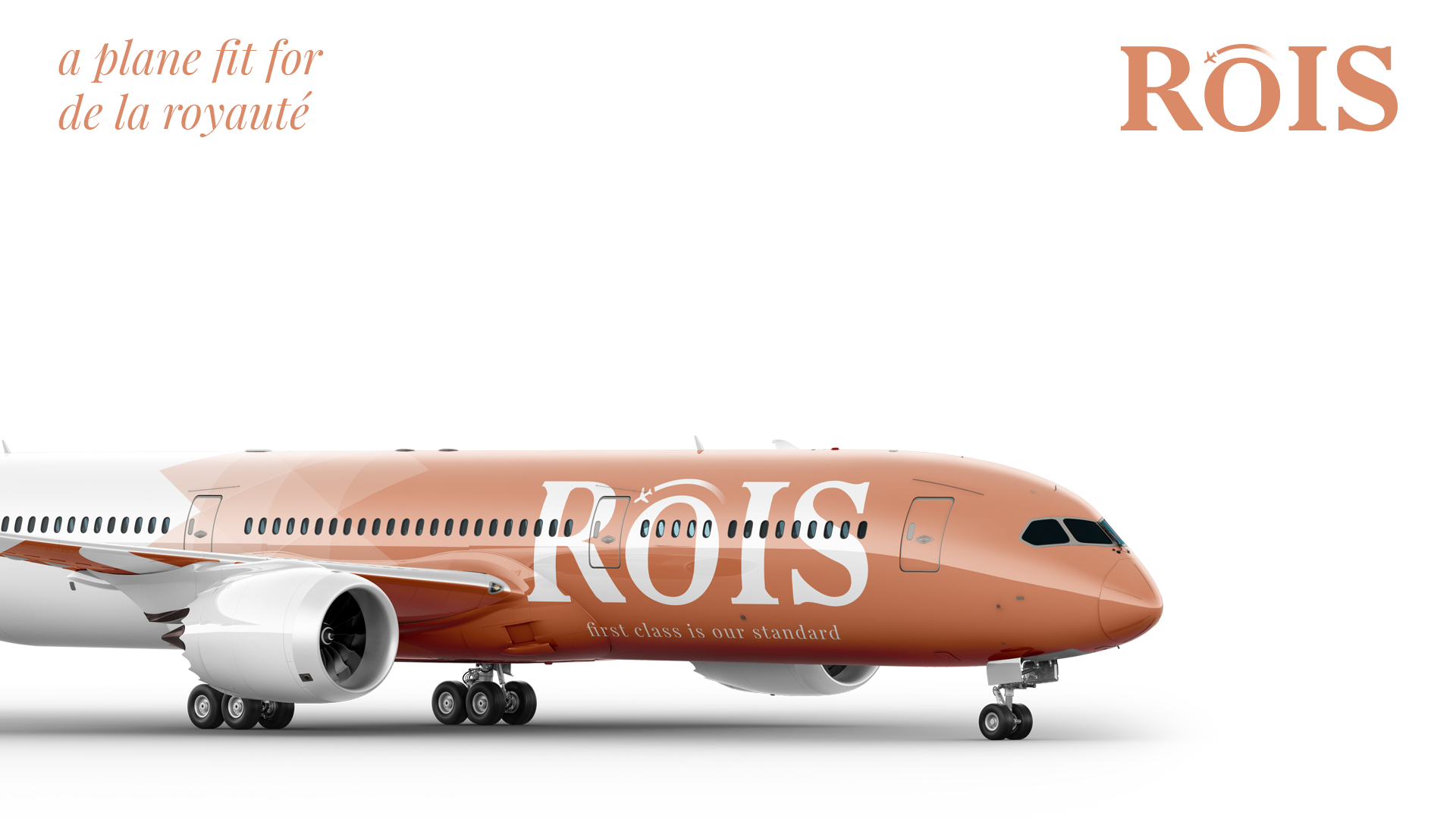
LIVERY
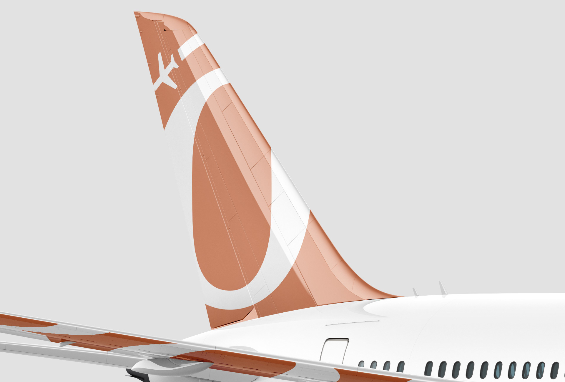
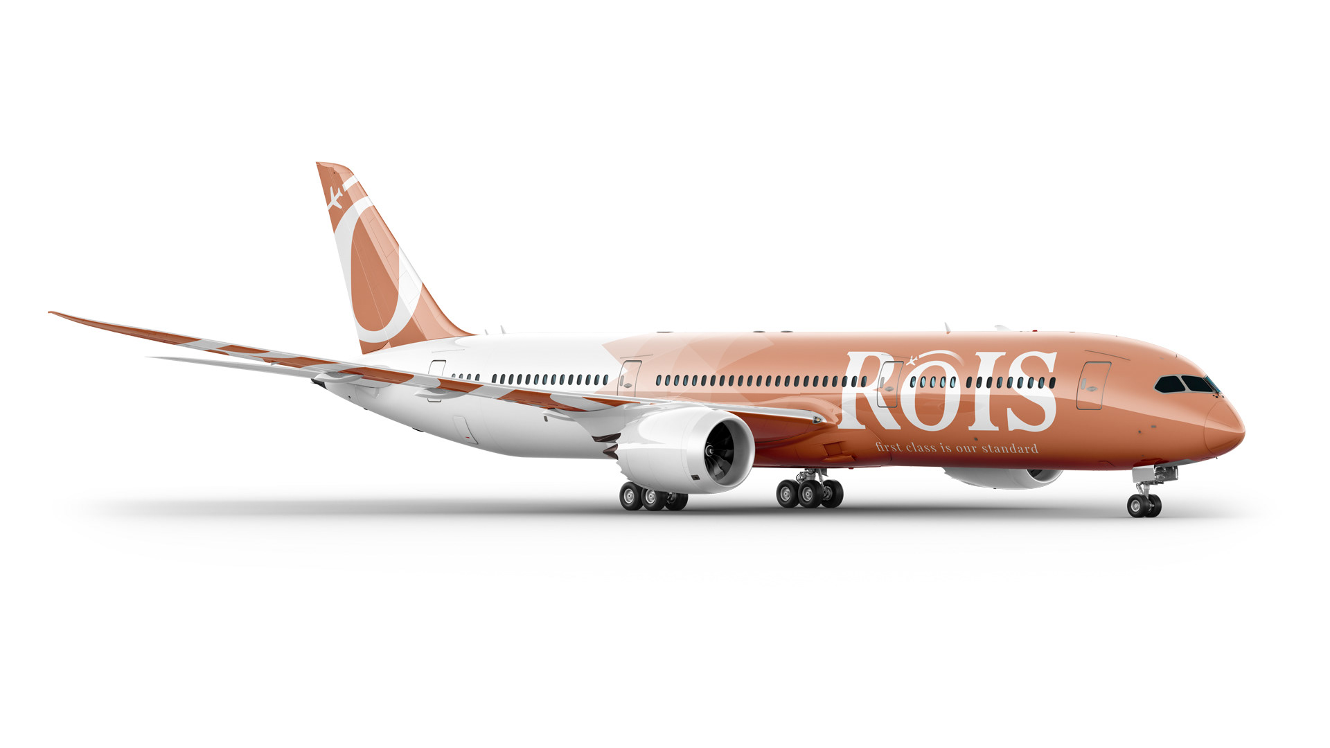
Possibly the most iconic part of an airline's branding, this has to make a statement and be distinguishable straight away. Therefore, the off-bronze colour is the base colour of the plane. The use of triangles to fade to the white is another key element in the airline's branding. This suggests dynamism and constant movement - which can be interpreted in various ways: the brand itself never sits still, and is always looking for ways to improve itself, or the more simple idea of that its planes never stop ensuring a rapid, on time service to its customers. The logo, complete with the slogan 'first class is our standard' is placed on the side of the plane to remind the customer of the standards they should expect just before they board. The logo is abstractly placed on the underside of each wing to make it recognisable from below, whilst the tail has the icon placed on the tail.
PROMOTION
Along with the launch, ROIS released four posters that would be displayed in airports and major transport hubs in the United Kingdom and France. The bi-lingual copy helps give the airline its unique communication language, and a sense of internationality. The imagery used on the posters are deliberately simple - to ram home to the viewer the staples of ROIS' brand so it becomes instantly recognisable.