
Although not your standard graphic design, creating football kits is something very close to my heart. Believe it or not, it is actually how I got interested in graphic design as a career, as well as a passion and before all that, a hobby. Back to my days working for fmscout.com, I was regularly tasked with creating fantasy kits that people's teams could don in their Football Manager saves. The day a new season's kit is revealed is one of the most important days in a football fan's season, and when the design flops it can have a catastrophic effect on fan's morale so I always try to keep that in mind when designing them. They also should have meaning, as this is often overlooked, drawn from the past or their geographical location, or tradition that football clubs are steeped in, as it gives the fans something to hold on to whilst being at the forefront of modern fashion.
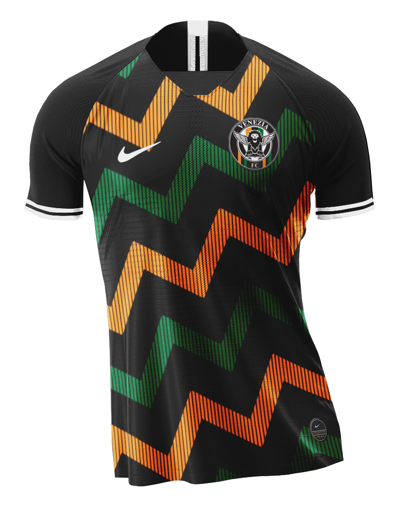
VENEZIA
This home jersey takes inspiration from some of Nike’s most breathtaking designs, mainly the Nigeria 2018 World Cup kit that became a fashionable piece of apparel as well as a kit for the national team. The abstract pattern is inspired by the canals of Venice, whilst the channels in between them represent the narrow pathways that wind round the city. The pinstripes create breaks in the lines, with the rectangles representing the islands that Venice is situated on.
Home
Away
Third
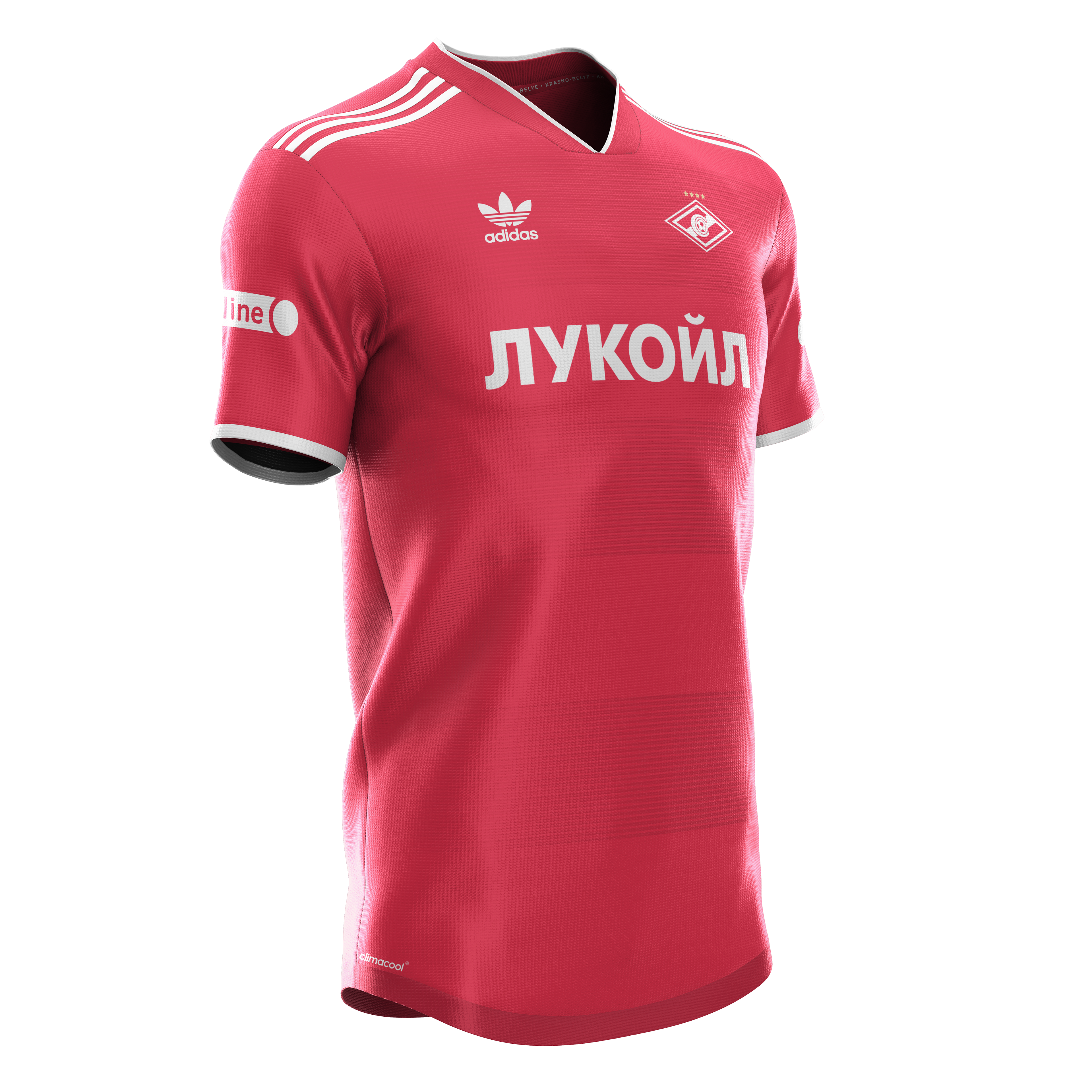
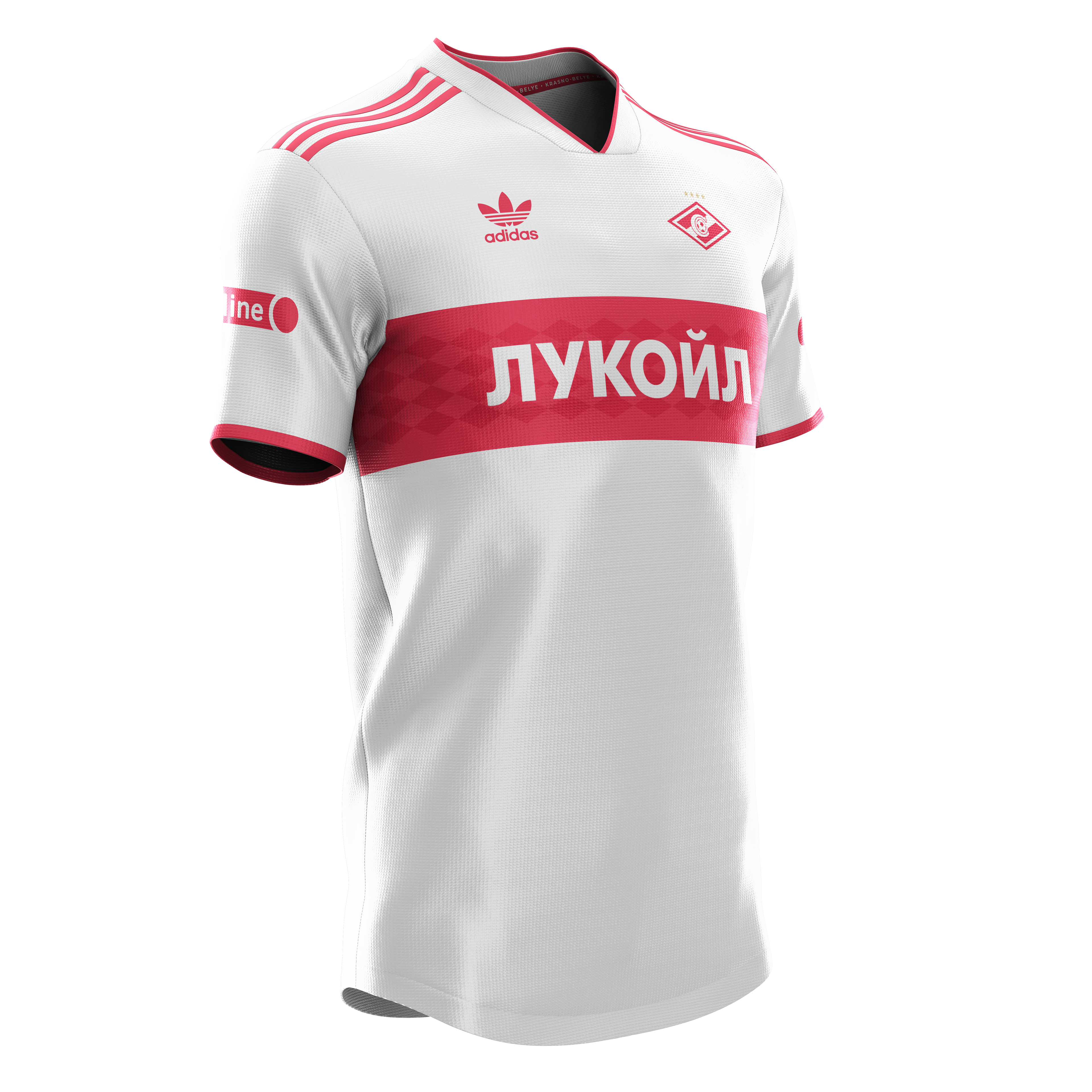
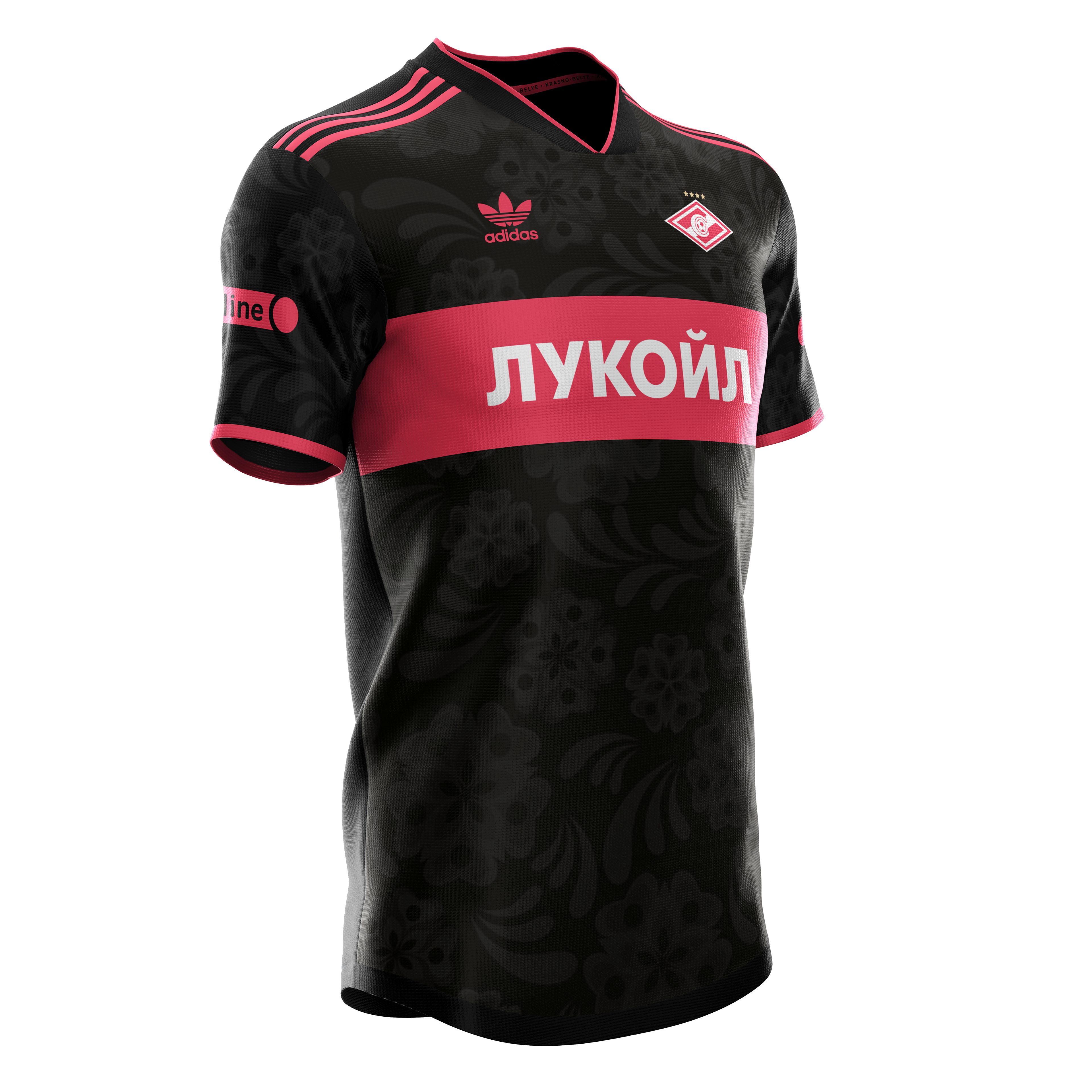
SPARTAK MOSCOW
The home kit was inspired a kit produced by Adidas in the 1980s, which featured a florescent texture and hoops, which inspired the texture and design of the kit. The use of the Adidas Originals logo on all three of the shirts is a reference to this, as it was their main logo at the time that the inspiration kit was produced.
The away jersey is slightly more traditional, featuring the classic Spartak bar across the chest, which is filled with a diamond pattern sourced from the club's iconic chest. The third kit features the bar again, without the diamond pattern, and a traditional Russian pattern faded into the background to create a unique texture.
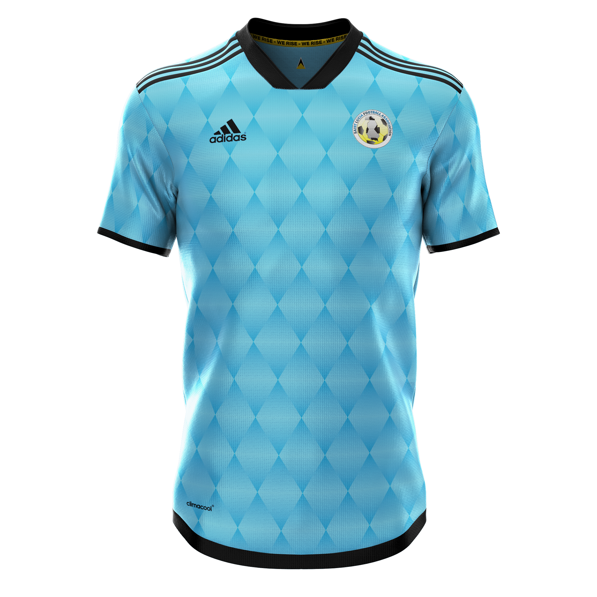
ST. LUCIA
Inspired by the island’s most iconic landmark the Pitons, this design channels the 1990s crazy football kits with a modern interpretation to create a vibrant pattern that will get them noticed. It even picked up attention from the St. Lucia FA.

Home
Away
Third
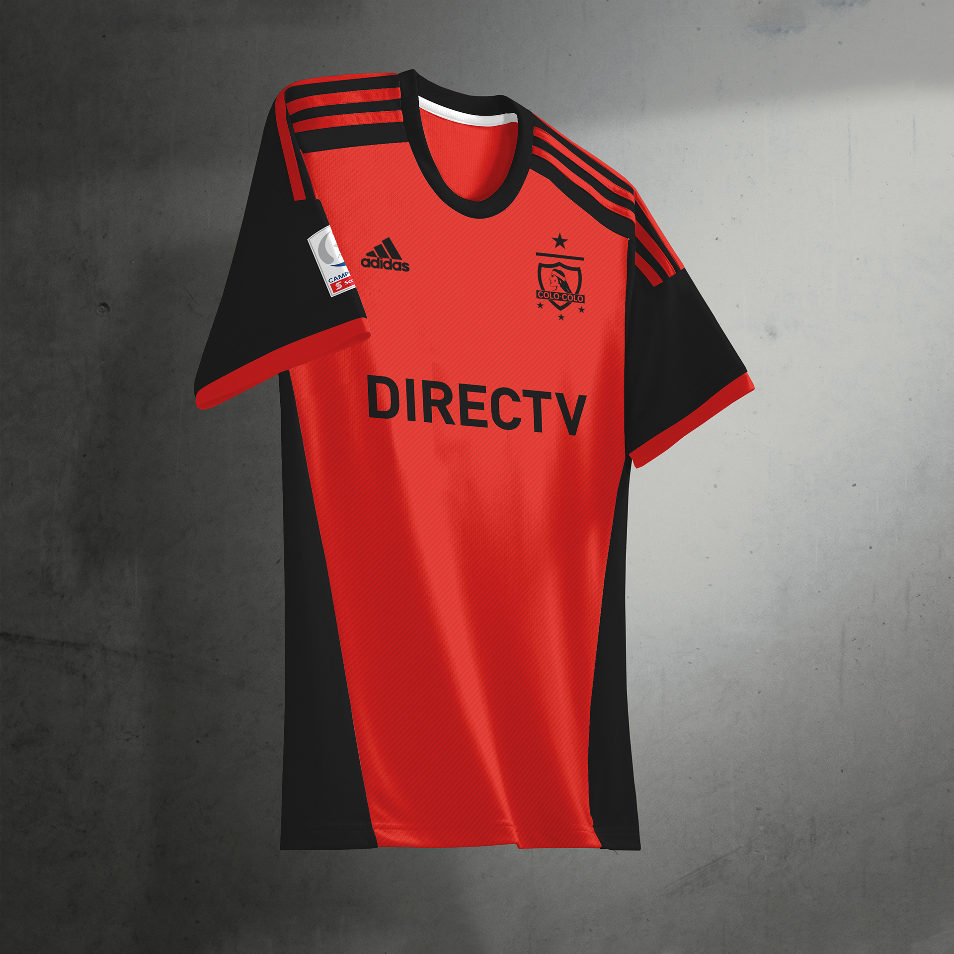
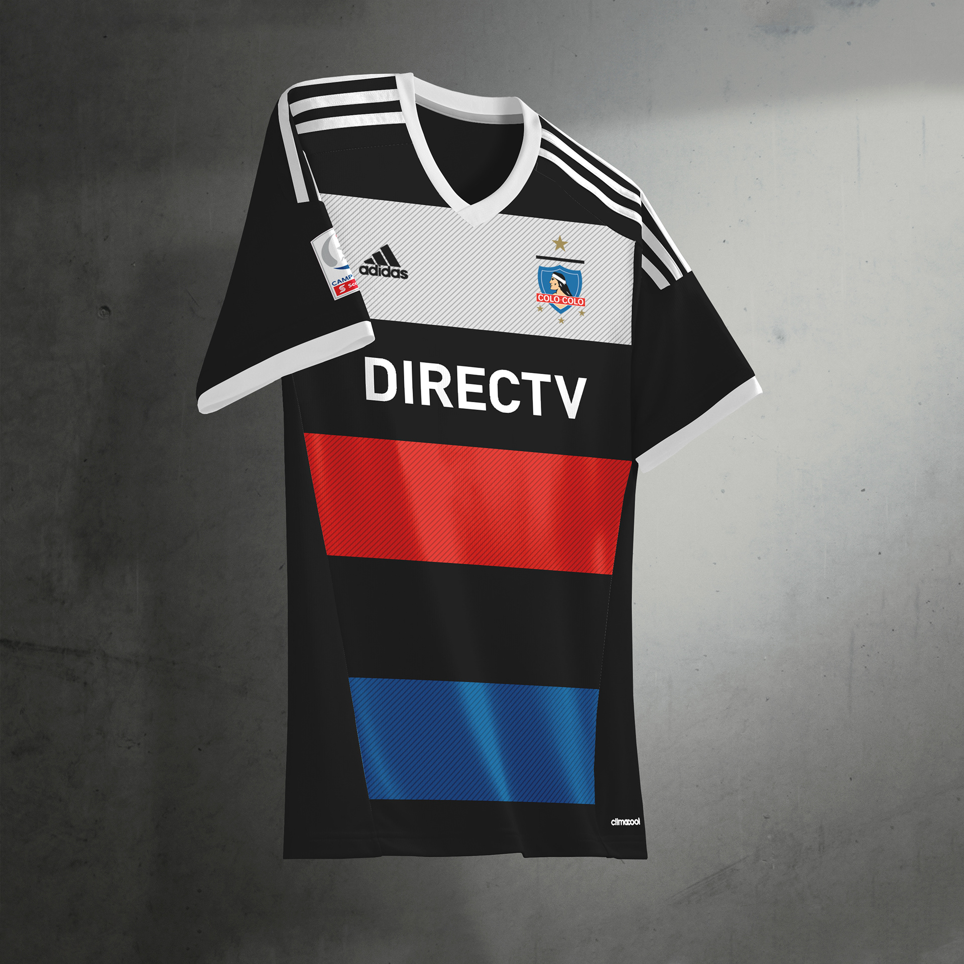
COLO-COLO
One of South America's most prestigious clubs, Colo-Colo is a club of deep tradition. I designed kits that would represent this, with the home and away jersey's sticking to historical designs. However, third kits are typically more 'out there' and although this design isn't particularly garish, not before has blue featured on a Colour-Colo kit. It didn't go down very well with fans on Twitter, however!
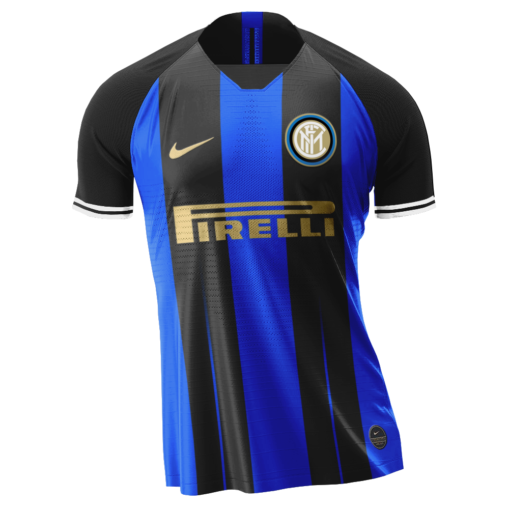
INTER MILAN
One of the recognisable jersey's in the world, Inter's fans are very particular about how abstract the home kit becomes, and that can prove a real challenge when trying to design something contemporary and fresh every year. This version of the home kit ditches the traditional thinner stripes and goes for a bold, two black stripe design. The gold details add the class that Internazionale is famed for.
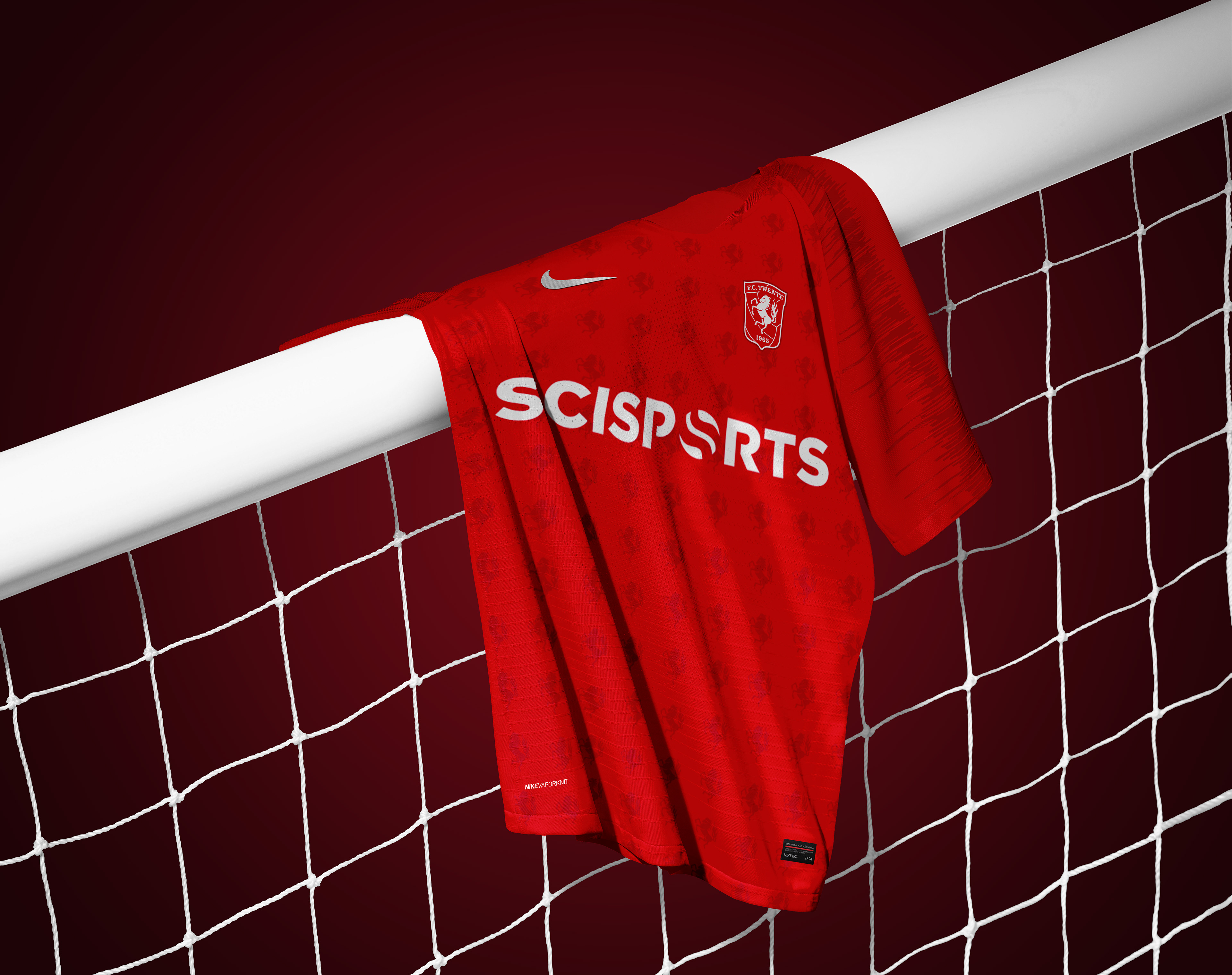
FC Twente
Although successful in the past, FC Twente are now struggling with finances. However, to ensure they remain as one of Holland's big names - they need an identity to match. Printed on the home jersey is a pattern to make the club instantly recognisable - as let's be honest how often do you get a kit covered in horses?
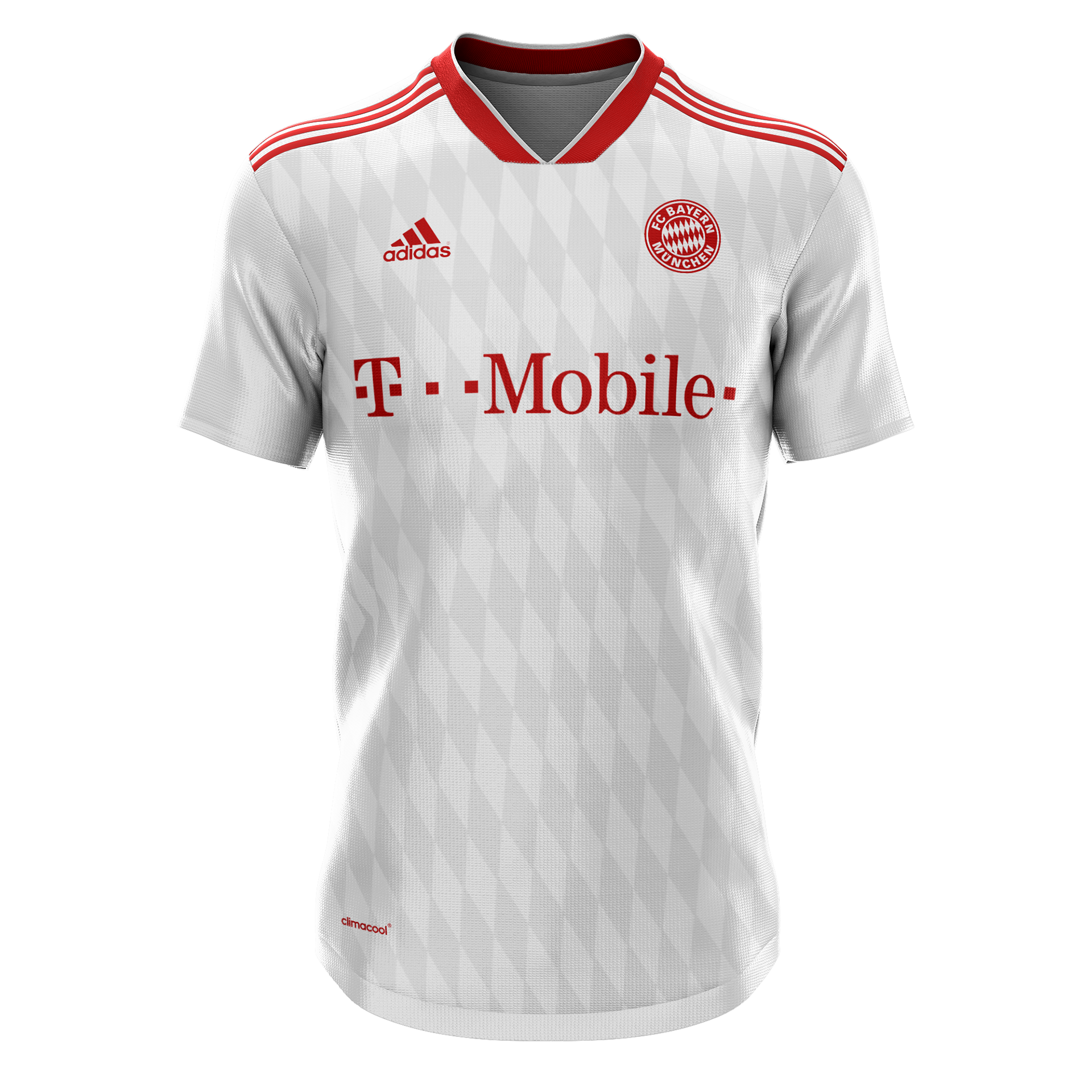
BAYERN MUNICH
This away jersey is designed to be a timeless classic with a splash of modernity. The pattern displayed on the main body of the kit is inspired by the Bavarian flag, which in turn forms a huge part of Bayern crest, and the pattern which adorns the world-famous Allianz Arena, where Der FCB play their home games.