Client: Self-Initiated

LOGO
The logo's shape is inspired by the entrance of a local cave, which is centre of many local folklores. This provides a clean shape for the rest of the elements to sit inside. The castle is the key centre-piece as this is arguably the town's most famous attraction, whilst the windows are shaped the same as those found in Waverley Abbey, England's first cistern abbey. The two larger leaves are oak leaves, whilst the leaves on the left are lime leaves, with both trees found throughout Farnham Park - a park that has seen the likes of King Henry VIII visit and hunt deer in its grounds. The smaller leaves on the right are in fact hops, which symbolise the towns relationship with beer and breweries. The river shape at the bottom of the logo pays homage to the River Wey which flows through the town, but simultaneously represents the many paths in the town, park and surrounding countryside that can be explored.
The logo is designed using lines. This is inspired by current design trends, showing the town is current and trendy; important for attracting visitors. It also represents the town's status as a Craft Town, with the animation of the logo being similar to that if it was being drawn with a pen.
The main colours of the department are green and cream, with the former being used by the town council and is inspired by the Farnham Park, whilst cream buildings are a fixture in the town centre - particularly on the town's most famous street - Castle St. Supplemented by Red Brick, which is inspired by the Georgian architecture in the town.
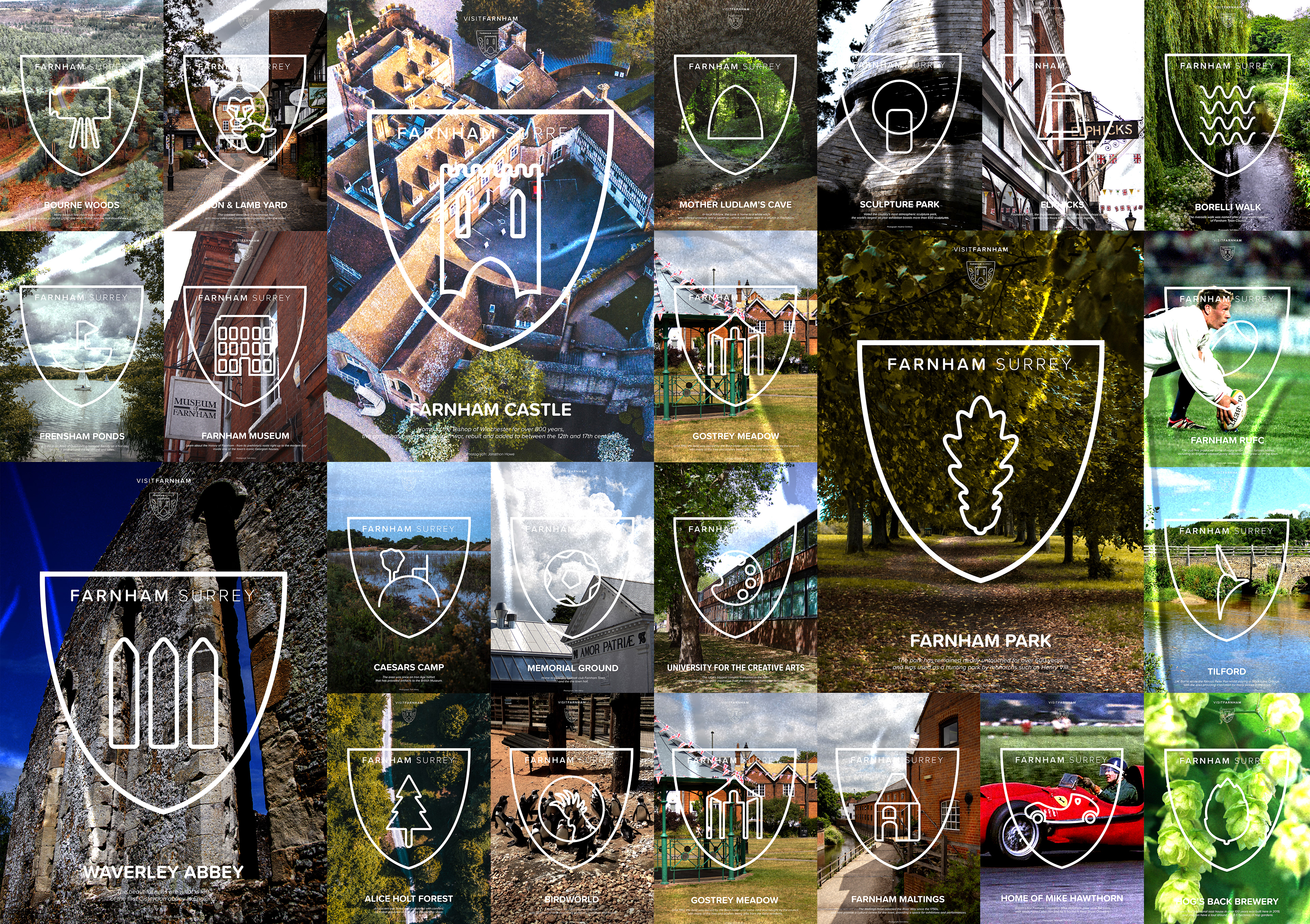
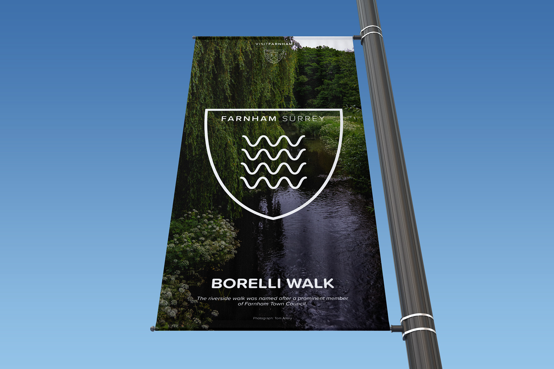
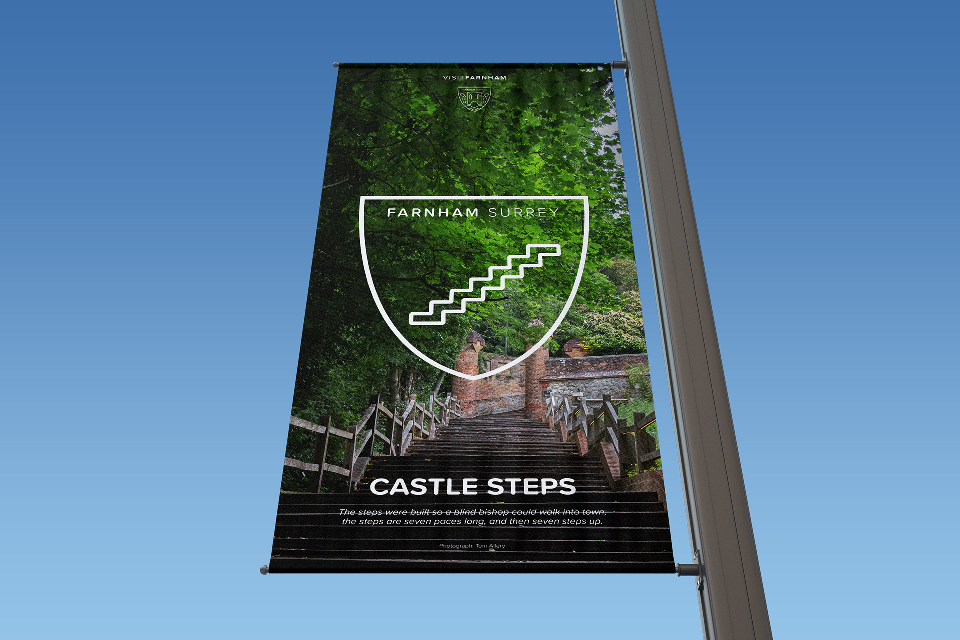
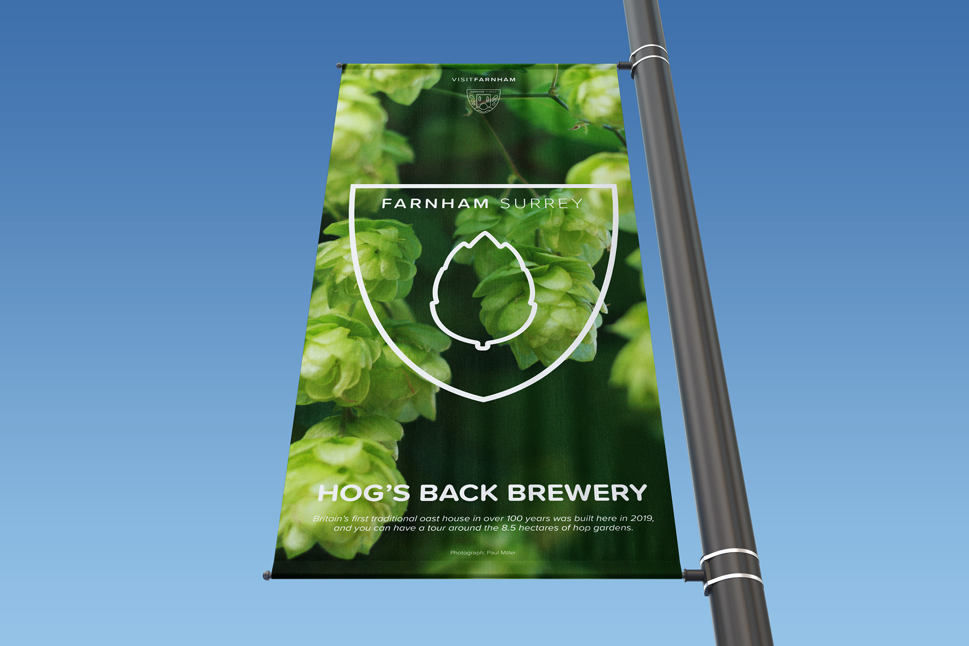
ICONS
Alongside the overall logo, a set of sub-logos were designed for each individual attraction in the town. This allowed for each place to be recognised individually, and the viewer can gain an understanding of what the attraction is quickly. To ensure brand continuity, the icons were designed at the same weight as the original logo, and placed in the same shield. There are many uses for these icons, such as on posters and banners which would be seen in the town, at the location of the attraction and in surrounding areas to promote them. Each poster has a photography base, inspired by the creative nature of the town, alongside a small description of each attraction so that if the viewer is interested, then they can get a summary quickly.
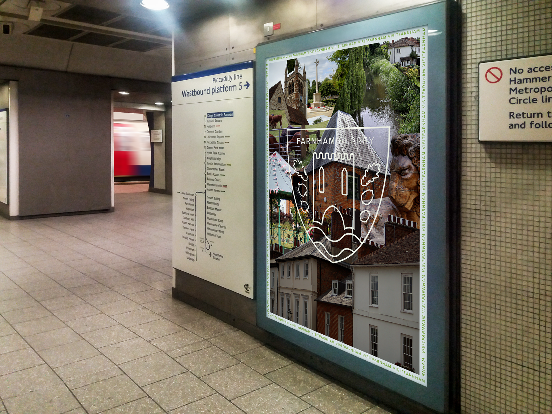
LONDON UNDERGROUND
Farnham is an hour, direct, on the train from London Waterloo. As one of the capital's major stations, a vast amount of tourists, and locals pass through it daily. A series of print and digital posters have been designed to feature on the Underground and throughout Waterloo station. Designed as a collage - again paying homage to the craft town status and the University of the Creative Arts campus in the town, it provides a quick and visually interesting way to document what the town has to offer. The array of colours and different photographs also attract the viewer's attention quickly, which is important in such a fast paced environment - they can then choose whether they want to stop and work out the individual elements. The type of person who would visit the town would most likely be interested in history and nature, and therefore take in their surroundings and understand visual challenges, making this an appropriate method to advertise the destination.
SOCIAL MEDIA
To supplement the print campaign in London, a social media campaign was also created. Mainly focussing on Instagram, a sponsored post such as the one above featuring the logo would appear amongst the feed, as it could on Facebook too. On the right is an example of one of the sponsored stories created which features the same principles as the print campaign, the idea of a collage, but this is ripped away to reveal text underneath, summing up the town and what it has to offer.
Please note that not all the photography used in this project is my own. Each poster has photography credits at the bottom, but I would like to express my thanks to Jonathon Howe, Ian Hughes, Michael Holbyn, Paul Miller, Getty Images, Babelstone / Wikicommons, Tarya KHR / Photobucket, Heather Smithers, and Lewis Hulbert for the photography used in this project.