Client: i2i Sports
Date: March 2022 - present
ABOUT MY ROLE AT i2i SPORTS
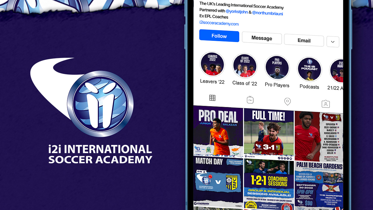
I2i Sports run football academies for the ages 6-23, across three titles: i2i (UK) Football Academy, i2i International Soccer Academy, and i2i International Women's Soccer Academy. They are partnered with York St John and Northumbria universities (in York and Newcastle, respectively). As the sole designer at i2i, it is my responsibility to design all the content that goes out on social media, in which players, ex-pros, coaches and parents all interact with.
During the summer and 2022/23 pre-season it was decided that the academy's social media image would be updated to seem more current, professional and appeal to the target audience better than the previous designs, which were commissioned before I joined the company a few years ago. With the new academic year upon us, it seems right to compile what has been done so far.
ELEMENTS & FONTS
Before the summer, i2i's social media had no set brand guidelines, and after different designers wanted to put their spin on things over the years, they had ended up with a mish-mash of content and styles. Therefore, one of the first jobs of the rebrand was to sit down and decide on a style that would carry through every graphic produced to make the brand more cohesive and professional.
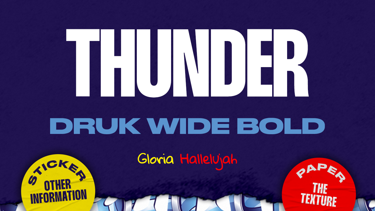
It was decided that a paper effect would be the basis of the design style. Used by various professional football teams this season, mainly Watford, the style is modern, energetic and allows scope for interesting design elements and layouts. The use of stickers to supplement the designs to highlight other information adds to this paper / handmade feel.
Previously, the main colour of the academy has been red. After conducting research into colour blindness (deuteranopia) to improve accessibility to i2i's content, it was decided to move away from this. Therefore, it seemed natural to take advantage of the rich blues used in i2i's logo. To allow for maximum contrast, the navy blue was decided as the background colour, with light blue and white the secondary colours of the brand. To maintain some continuity between the previous branding, red was selected as the tertiary colour of the International Academy, and yellow was selected as the tertiary colour for the UK Academy to help differentiate between the two.
In designs of the past, there was no set font, let alone a hierarchy. Previous heading fonts used included Bebas Neue and Impact. It was decided that this needed a refresh, but to keep brand continuity a bold, condensed font was required. Designed by Rajesh Rajput, Thunder was seen as a modern upgrade on the previous fonts, and its versatility with styles and weights made it the perfect, adaptable headline font to attract attention to posts. Druk Wide was selected as the secondary font - the extended glyphs provides contrast to the condensed nature of Thunder whilst being contemporary, and easily legible for social media. The third font, primarily only used in briefs targeted at the younger market is Gloria Hallelujah - a handwritten font that compliments the ripped textures and makes the design feel more homely.
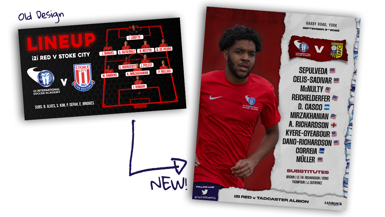
TEAM SHEET
So parents across the world can keep up with their kid's games, a Starting XI is posted across social media for each match. The previous design was dated, using garish colours, odd sizes and hard to see headshots. After conducting some research surrounding what clubs put out on their social media for their line-up graphics, and chatting to some of the ex-Premier League coaches, it was decided to drop the line-up graphics and just list the team. The dimensions of the graphic also changed from landscape to portrait so it could easily fit more social medias without odd cropping and take up more room on the phone screen, making it more noticeable. Therefore, one main image of a player who is starting the game was added. To give more of a sense of identity, the ripped style and logo collage was carried through from other graphics.
i2i has numerous different teams, all named after colours. Therefore, so it was easily recognisable to which team was playing, the background colour changes. These colours were also muted slightly to suit being a background, and the textures were inspired by the circles in the i2i logo, representing the international nature of the academy. To promote this even further, the nationality of each player was added - making potential students feel at home no matter where they come from across the globe.
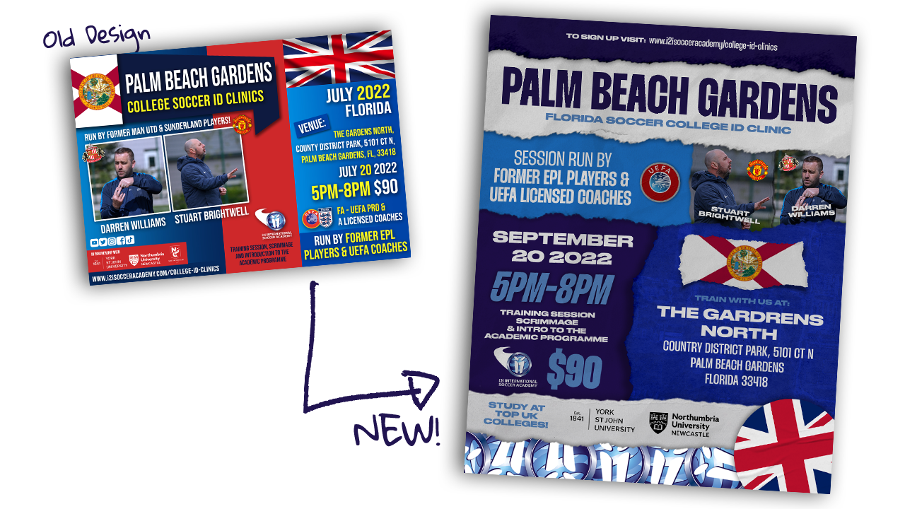
ID CLINIC POSTER
To help recruit new students, i2i regularly travel across the world to hold ID Clinics, held by the company's directors and ex-Premier League coaches. When one of these are announced, a poster goes out on social media to promote it. The old poster was chaotic, hard to read and very dated in its design. Therefore, a new one was created to match other graphics being produced. Once again, the size has been changed from landscape to portrait to avoid cropping, and make it easier to digest. A new hierarchy was also decided, and sectioned up to make it easier to read whilst providing picture elements to help with memorisation and to make a poster that has to fit a lot of text information on it seem a little less overwhelming.
ID CLINIC PROMOTION
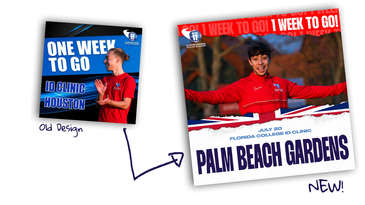
To help promote the ID Clinics, i2i post countdowns to create suspense. The old graphics are certainly dated, with the textures in the background. Therefore, I wanted to eliminate these in the new design and it made sense to make the most of i2i's full-time photographers, so a photographic approach was settled on. Mainly, shots of students celebrating or smiling are used to help promote the academy in a positive light. Furthermore, the emphasis needed to be more on the clinic location rather than the fact there is one week to go, so this was made clearer in the graphic. To create contrast between the other graphics in the feed, the 'to go' section was highlighted in red to make it stand out in the feed. Other key information such as the date was added for better clarity.
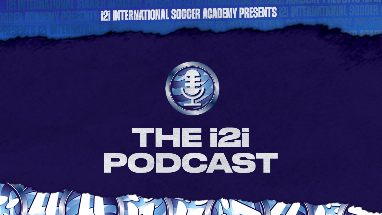
i2i PODCAST
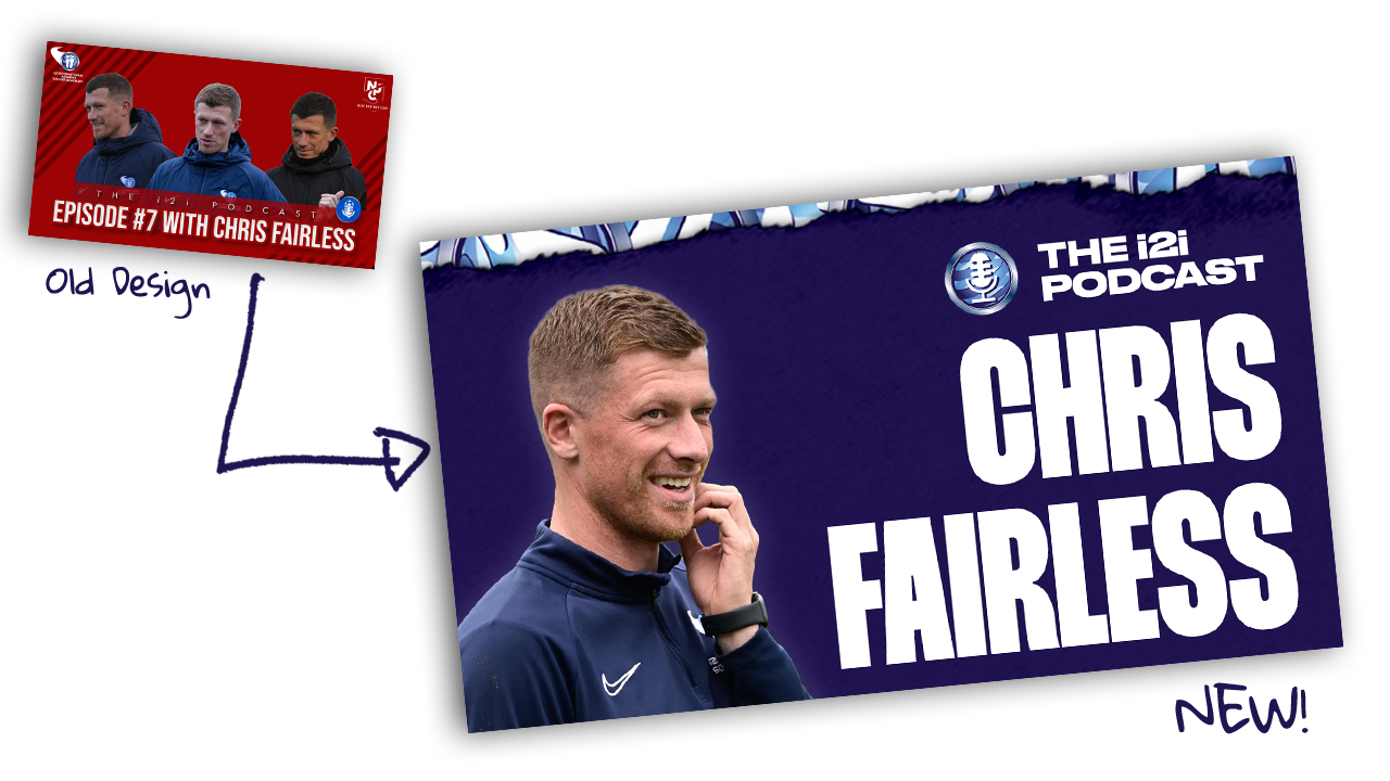
During the off-season and holidays, i2i record a podcast with current and former coaches students, such as Noah Fuson who is currently ripping it up in the MLS, winning the MLS Next Pro league title this season. To give the podcast a new lease of life, the identity was completely overhauled including a brand new logo and cover for Spotify. The YouTube thumbnails also received an overhaul - with the unnecessary text removed and them emphasis placed on who is featured in the podcast wrapped up in the i2i brand to make it stand out.